Spring Senior Exhibition
- Home
- Seahawk Life
- Arts
- Arts Venues
- Cultural Arts Building
- Exhibitions
- Spring Senior Exhibition
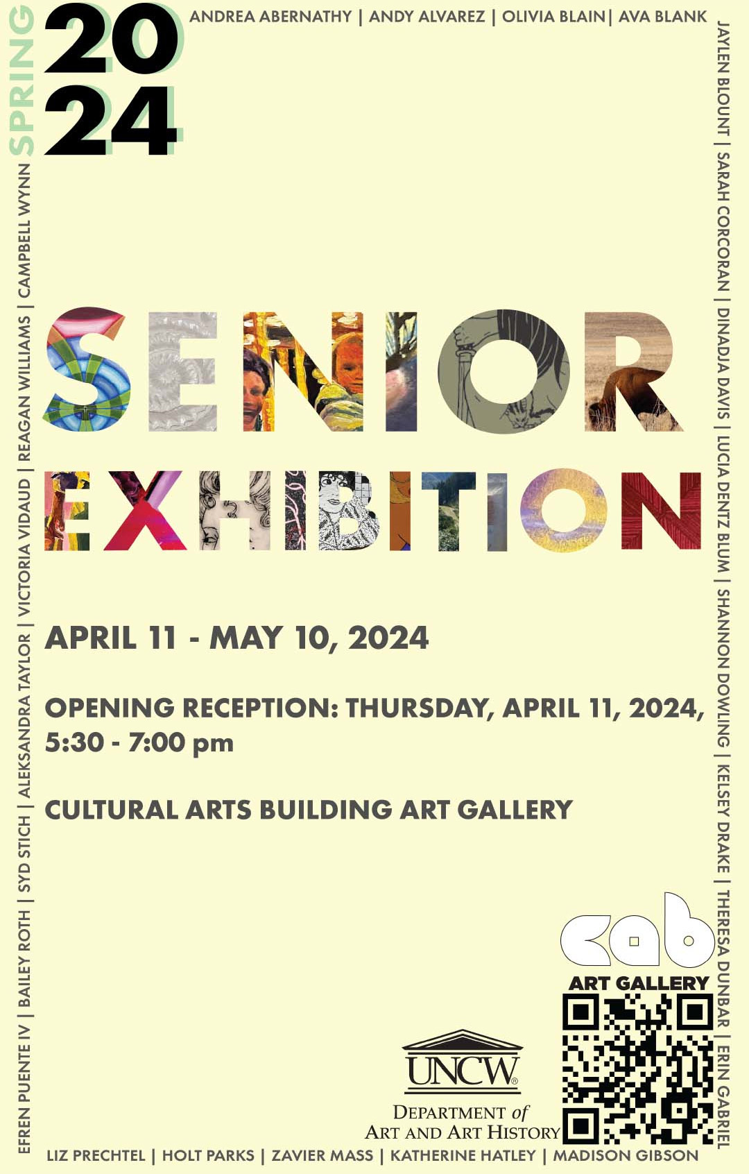
Welcome to the Spring 2024 Studio Art Senior Exhibition Catalogue!
This exhibition showcases 24 graduating students displaying a dynamic range of styles and techniques that push the boundaries of traditional art forms. Mediums featured include painting, photography, sculpture, mixed media, digital illustration, graphic design, installation, ceramics, 3D printing, and printmaking.
UNCW's Senior Exhibition is a capstone requirement for all seniors graduating with a major in Studio Art.
Artists
Artistic Identity, Memory, & Connection:
 The 2024 Spring Studio Art Senior Exhibition
Matthew Budd, Skye Dlugy-Hegwer, Cassidy Mateo, Hanna McMillan, & Melissa Story
How does one find meaning and joy in the current historical moment which is riddled with the impacts of a pandemic and tumultuous international politics? The studio artists of University of North Carolina Wilmington’s 2024 graduating class give viewers some answers through their personal meditations. The Senior Studio Art majors exhibit their technical skills in an effort to express their artistic identity, while pondering themes of memory, nostalgia, coping, and connecting. By looking closely at their art, one can find these connections that generate meanings and joy and helped this talented group of artists grow.
The Class of 2024 has navigated several significant historical events which have defined their collegiate experience. The Covid-19 pandemic began in early 2020, which altered modern society. Students transitioned from in-person instruction to remote learning to limit the spread of the virus, and back again to “normality.” Relationships changed, as did lives and the ways they approach the world. Additionally, the Class began their college journeys as massive societal upheaval occurred in America. In May of 2020 the murder of George Floyd led to a summer of sustained global protest regarding systemic racism. The Class of 2024 emerged amidst protest, and a demand for change. As this cohort focused on their studies, national politics remained fractious. On January 6th, 2021, supporters of former president Donald Trump stormed the United States Capitol building to thwart the final stages of the 2020 presidential election, laying bare the fragility of American democracy. Global events also affected the Class of 2024. The Russian invasion of Ukraine in 2022 and the 2023 eruption of conflict between Israel and Palestine have continued to increase global anxieties. Indeed, this historical backdrop of turmoil is bound to inform these artists’ formative years in ways big and small.
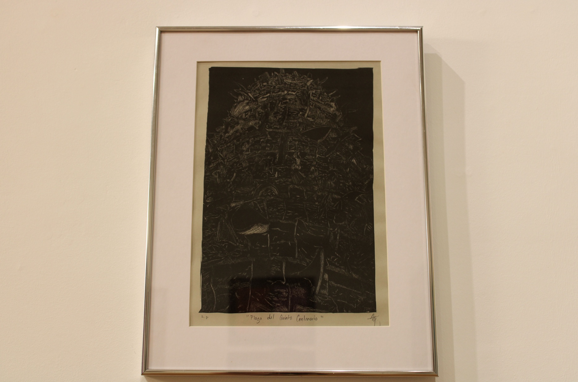
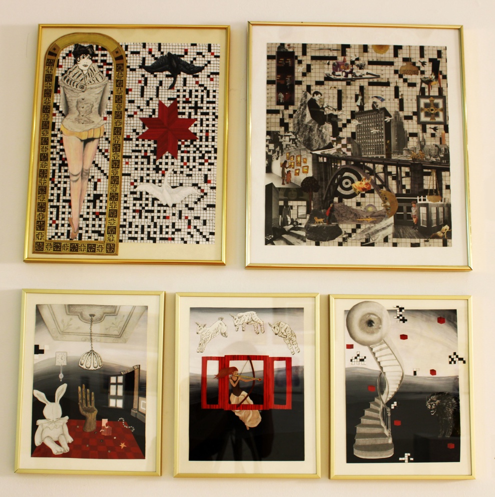
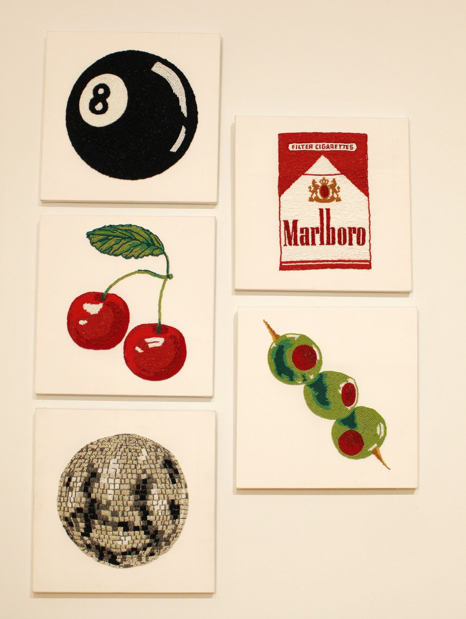
In addition to history, art history weaves its way in and out of this exhibition to influence the art of this year’s graduating class. German expressive artist Kathe Kollwitz, said “It is my duty to voice the sufferings of men, the never-ending sufferings heaped mountain high.”[1] Those words rightly apply to multiple artworks in the show such as Andy Alvaraz’s Plaza del Quinto Centenario, in both printmaking technique and themes of colonialization. The work of artist Bailey Roth finds root in Dada by way of Hannah Hoch’s Cut With a Kitchen Knife Dada., while Olivia Blain’s work calls to mind art from the 19th century equine painter Rosa Bonheur. Hilma af Klimt seems to have transcended time and spiritual boundaries to work her way into the abstract works of student Lucia Dentz Blum. Pop art and postmodern influences abound in several artworks in the exhibition, but it is the work of artist Syd Stitch that uniquely stands out. She stitched together the influences of Warhol, Richard Prince, Jeffrey Gibson, and others to tell the tale of a night on the town. By understanding this graduating class and the art historical references to which they look, a bigger picture begins to emerge of a group ready to make their own mark on the art world.
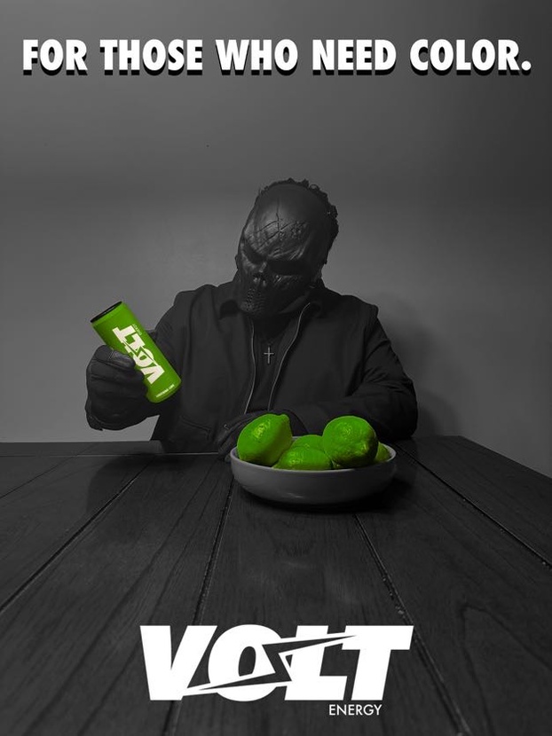
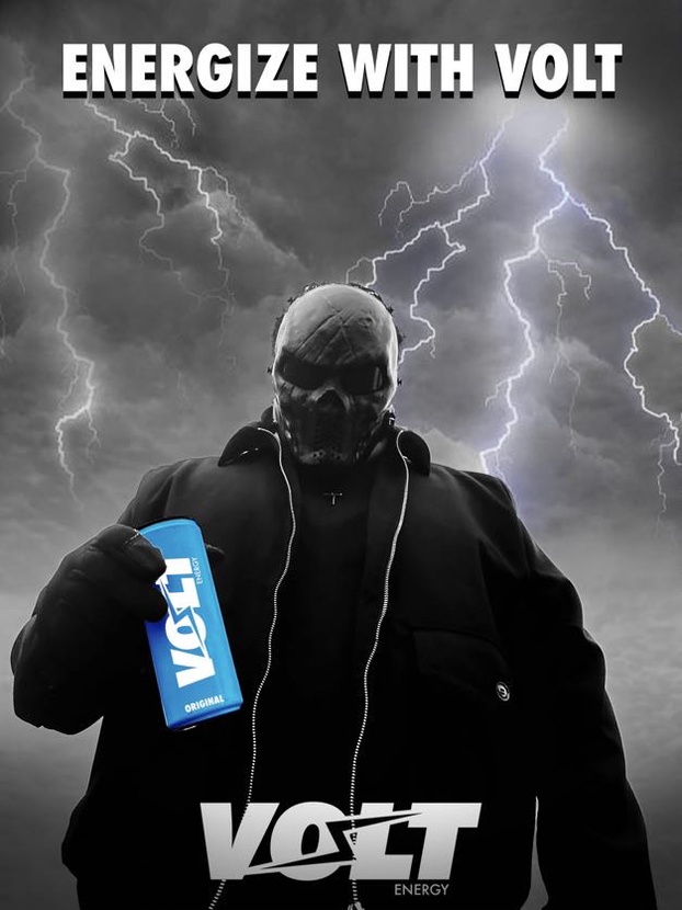
In this moment of their lives, the studio art majors of UNCW’s 2024 class are in transition, culminating the growth of their artistic education and moving into the professional world. There, the formation and presentation of their artistic identity is critical to their success. In a way, they have something to prove and the Senior Exhibit acts as their first opportunity to display the technical skill that they have harnessed over the past four years. Efren Puente IV, for instance, designed an advertising campaign for a fictional energy drink, exhibiting his graphic design and advertising capabilities to future employers. The series features a dark, masked figure satirically interacting with bright energy drinks, perfect for today’s world of social media advertising. Others like Olivia Blain more traditionally capture the likeness of horses in her oil paintings such as Oak Island Beacon. In doing so, she illustrates her ability to render the natural world with refined photorealism and beauty. While each of the artists in this show illustrates their technical skill as a facet of their artistic identity, many also infuse that professional identity with the personal.
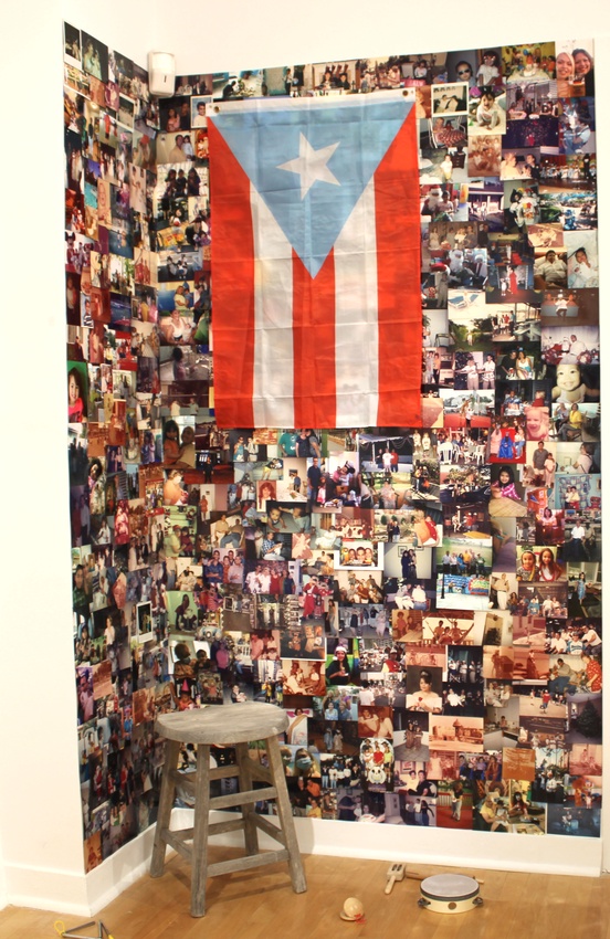
As artists and humans, we often look to the past to contextualize our present. There is so much to be taken from the influence of one’s childhood and background that speaks for how we evolve as people and as artists. For the class of 2024, much of the final exhibition relies on their experiences growing up and their perspectives on life as they have navigated through a global pandemic. Many of them look for inspiration from the time before COVID-19. Students incorporate their memories and aspects of nostalgia into their pieces to reveal the meaning behind their work. Artists like Madison Gibson use specific details from her childhood to create a third space that includes a collaboration of her memories and what brings her comfort from her childhood. Andy Álvarez dives into her past as she highlights moments from her childhood in Puerto Rico in an emotional collage of photos. The piece celebrates Álvarez’s past and identity by combining photographs with childhood toys, instruments, and Puerto Rican music. Campbell Wynn reflects on familial scenes by photographs in gouache. The heartfelt scenes are inspired by her family and moments from her youth that resonate with her and continue to inspire her.
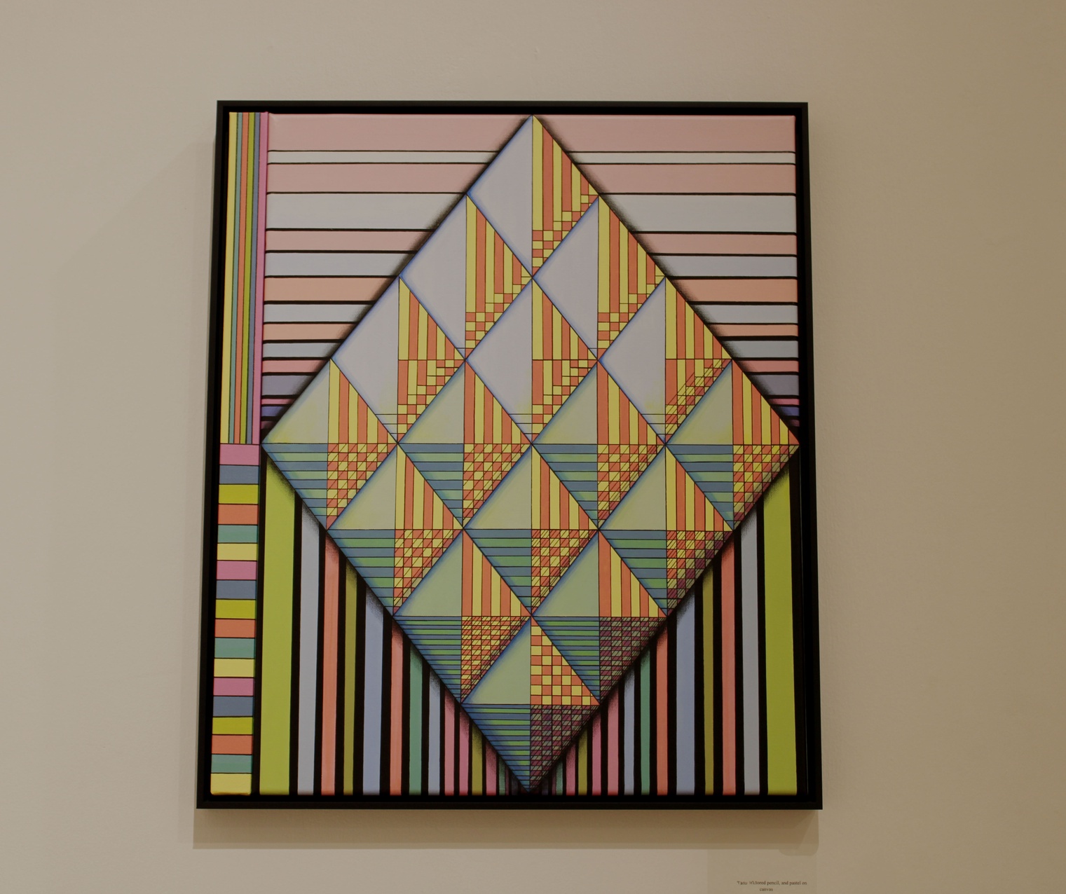
Coping and finding meaningful connections in a post-COVID environment has been a difficult experience for many Americans, artists especially. Aside from the pandemic, the personal turmoil and growth that all artists experience while they hone their craft has also been a significant part of the graduating class’s journey. Through this exhibition, we can observe the ways students express their willingness to bring viewers together and find meaning in our chaotic world. Artist Lucia Dentz Blum uses an abstract methodology to express the ways she copes and connects with the world around her. A House Divided uses a series of white and purple geometric shapes in perfect reflection with each other. In her artist statement Blum reflects on the larger purpose of her works: “[They are] about personal control, or lack thereof over the universe.” Her personal connection to religion is one way she has found the strength to overcome the hardships of our modern world. Other artists similarly look inwards, finding meaning in finding themselves.
Although vastly different in their individual practices, intentions, and results, each of these artists makes up a part of the collective experience of achieving their artistic education. When one looks beyond the surface of the Senior Exhibit, the graduating class reveals connections between thematic threads which illuminate the richness of this talented cohort. Thoughtful meditation on memory, coping, joy, and technical skill abound. Informed by their historical moment, the studio artists of UNCW’s 2024 graduating class have given viewers a glimpse into their artistic and personal identity through their collegiate magnum opus.
ANDREA ABERNATHY
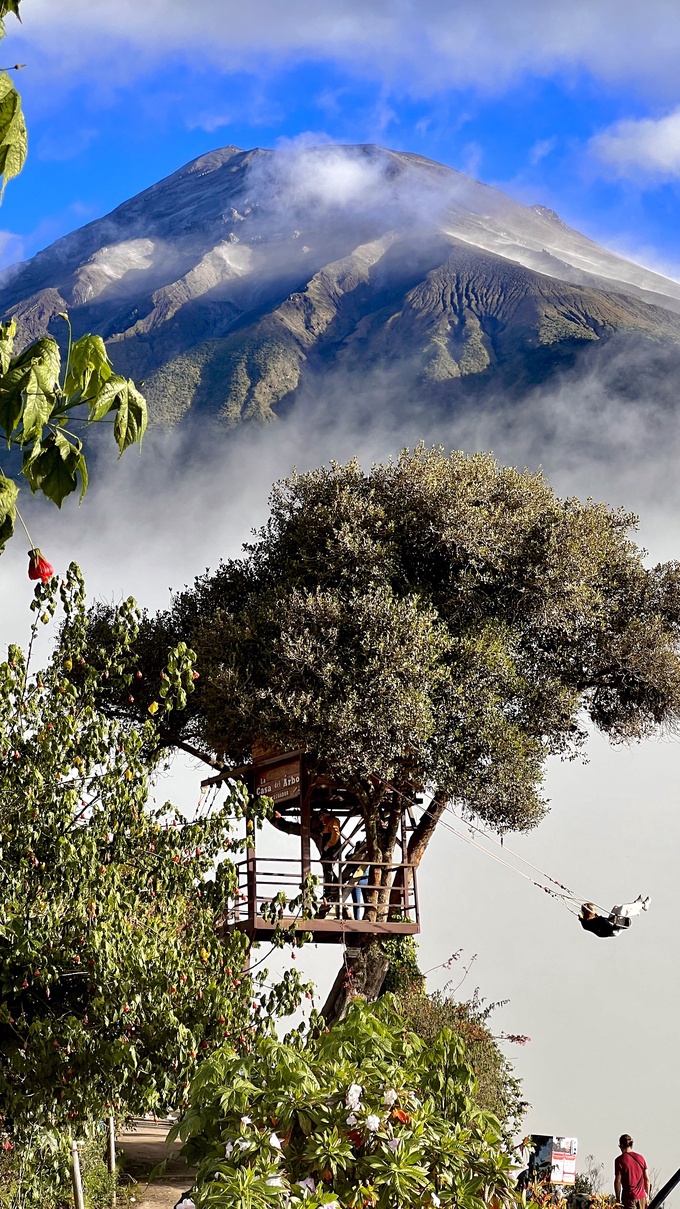
Photography has been a real gift in my life. It has given me the joy of capturing people, places, and things. It is much more than the click of a camera; it can capture moments that become memories. My favorite moments are when I am abroad in a new place, whether its hiking the Himalaya’s, volunteering in an orphanage in Ecuador, or visiting Machu Picchu. Each place I have been has taught me so much about life and cap- turing these places is a gift that I want to share with others.
Mexico, Colombia, Peru, Nepal, and Ecuador. I had a life-changing experience in each of these countries. These countries are considered third world counties because they are poor or developing countries, but they are beautiful and have so much to offer. I was born in Colombia. They have a poor reputation due to their history; this country offers so much diversity and culture, and it does not get the love it deserves. I travel to Ecuador with my father when he takes groups of students to an orphanage to do missionary work. This country is my second home. I have been there every year since I was about eight years old and grew up making so many friendships that I consider family. Peru is one of the places I had always wanted to travel to and seeing one of the wonders of the world was truly amazing. Last summer I went to Nepal. I hiked through the Himalayas for five days, staying in the mountains overnight. This was a once in a lifetime experience and was a great opportunity to disconnect from the world and enjoy the beautiful surroundings. For two weeks I took a trip to Mexico for the second time. There I spent time in a small village surrounded by beautiful views and learning about the culture.
Traveling to all these places has shown me how beautiful it is to travel, to get out of your comfort zone, and make new memories. Every place I have shared has shaped me into the person I am today.
 |
Andrea Abernathy |
 |
Andrea Abernathy |
ANDY ALVAREZ
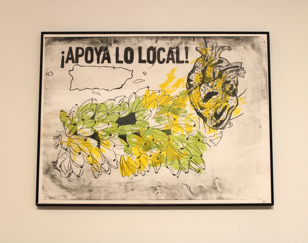
As a mixed media artist, I use art to connect with my home and share an authentic experience of what it truly means to live in Puerto Rico. Un pedazito de casa, Patriota, and Plaza del Quinto Centenario explore a balance between the beauty and chaos of the island, presenting themes of nostalgia, politics, identity, and culture. Since I moved to the United States almost 3 years ago, for education and survival purposes, there’s a sense of emptiness in me, a constant feeling of homesickness. Even though I enjoy living in North Carolina, it continues to be a culture shock and I find myself lingering on memories from when I lived in the Caribbean. I am in a constant limbo, wanting to live here and there, in a fight with my identity trying to preserve what is left of La Isla del Encanto in me.
I was born and raised on the island for 20 years, causing a connection with my home I haven’t been able to find anywhere else. Being able to see and live in Puerto Rico’s landscapes has been a blessing, but living in Borikén is also about persevering through what life throws at you. When I lived on the island I endured various droughts, earthquakes, Hurricane María and other hurricanes, floods, power outages and political movements. I want to share my experiences and memories with people to advocate for the island and Puerto Ricans, showing both characteristics of the island. Puerto Rico is my home, my culture, my blood, my identity; it deserves to be known for what it truly is, what it can be, what it has been.
 |
Andy Alvarez |
 |
Andy Alvarez |
 |
Andy Alvarez |
OLIVIA BLAIN
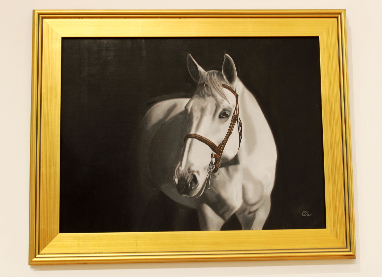
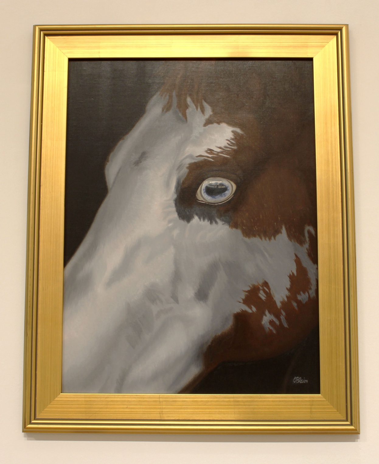
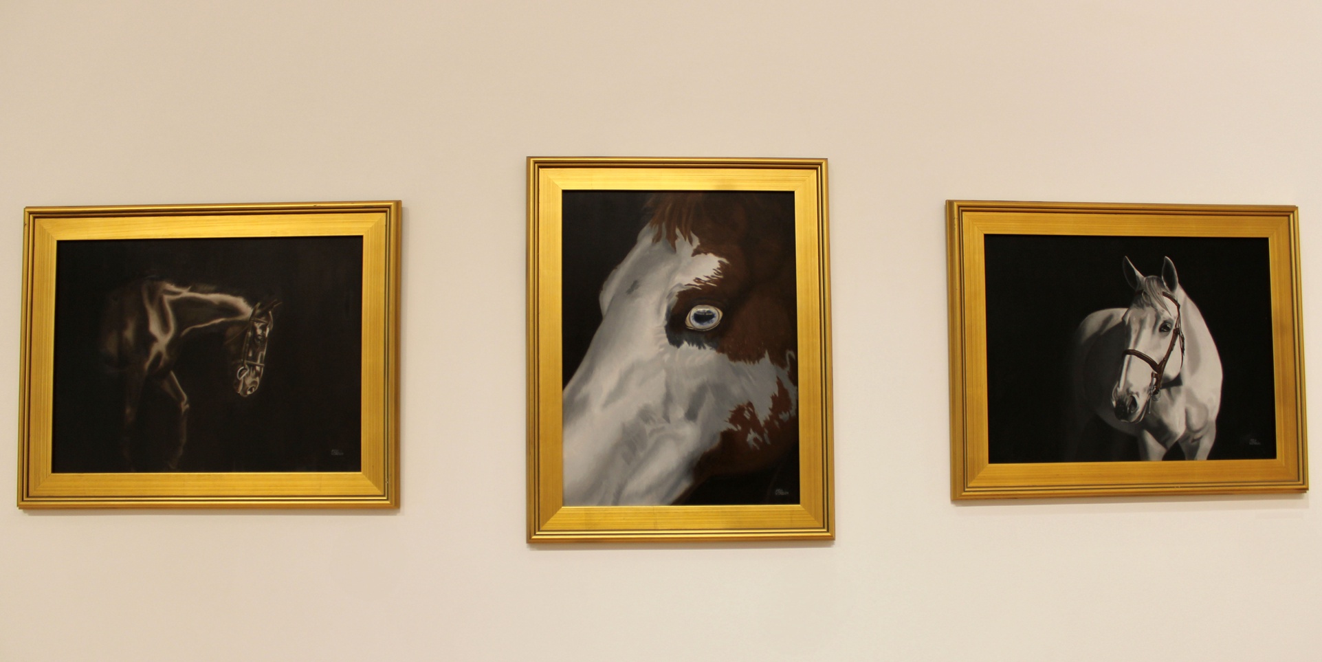
Through the use of oil paints, I strive to realistically render equine portraits inspired by my and others’ personal relationships with horses. I have been around horses almost my entire life, competed for over 10 years, and witnessed countless relationships between equine and human teams. In my paintings, I place an emphasis on traits such as beauty, power, and spirit. Through realism, I grasp the inherent beauty of the subject and am loyal to what I am seeing.
My background with horses gives me an insight into their personalities, anatomy, which poses to choose, and overall, the best ways to portray them. Understanding the bond between horse and rider connects me to the works and those commissioning them. Horses have been a primary subject of art for hundreds of years and I often reference classical equine portraiture through the compositions I choose. Even those who do not have relationships with horses can appreciate their power and beauty shown in my art.
This body of work was created with oil paints on oil primed linen boards. I work from my own photographs to accurately recreate the colors and values in each image. I begin by transferring my image to the canvas paying close attention to value changes and shapes. I then mix each color I have chosen and fully complete one section of the painting at a time. Oil paint dries slowly allowing me more time to achieve smooth gradients between values and render details. This process allows me to achieve a high level of realism in my work. Using oil paints, I portray the beauty of equine subjects, drawing inspiration from partnerships with these animals.
 |
Olivia Blain |
 |
Olivia Blain |
 |
Olivia Blain |
AVA BLANK
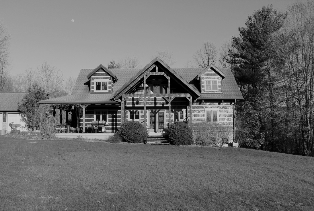
My work focuses on lines within architecture and nature using digital photography. My process begins by checking the weather. I find taking photos on sunny days produced the best quality images. By choosing one design element to concentrate on, I have an idea of what to look for prior to taking the photo. When shooting organic matter, I structure the figures within the frames the way an architect would design a building, by adhering to figurative grid lines. While shooting architecture, I consider organic matter by doing away with order within the frame of the image.
I use photography as my medium because I crave adventure. Digital photography allows me to take a break from my normal routine, exploring and documenting new environments. My photos explore the relationship between organic and inorganic lines within nature and architecture by comparing manmade structures to natural elements.
 |
Ava Blank |
 |
Ava Blank |
 |
Ava Blank |
JAYLEN BLOUNT
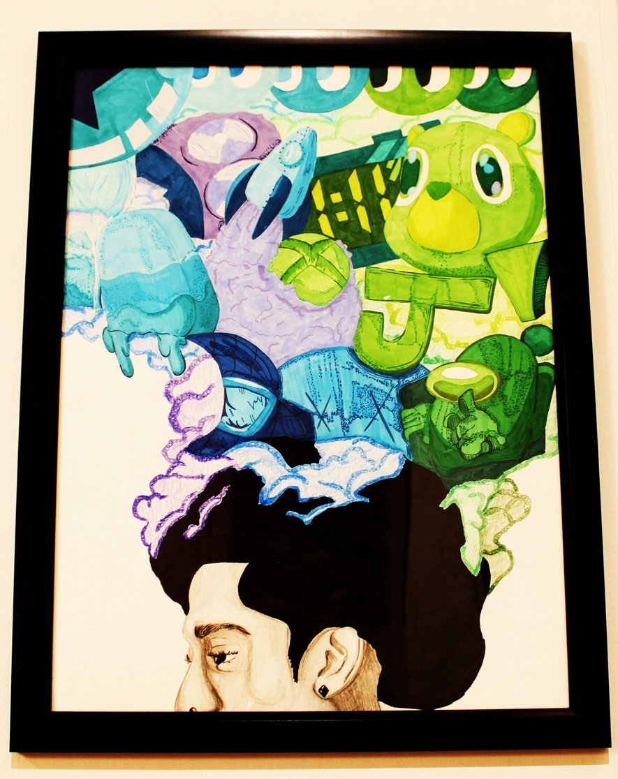
I’ve created the portrait Overflow, and it represents me, who I am, and things that I enjoy and my interests in the form of art. I work with color pencils, markers, and Bristol paper.
I’ve chosen to create Overflow to show my thoughts, images, and ideas that “flow” in and out of my head in a collage style, whether it’s just random images or meaningful things that I find important. Everything seen inside the cloud flowing upwards all describe the person that I am.
I want Overflow portrait to symbolize a window for the viewer, allowing them to get a feeling and understanding of who I am and some of things that interests me, almost like a first impression without me physically being there.
 |
Jaylen Blount |
SARAH CORCORAN
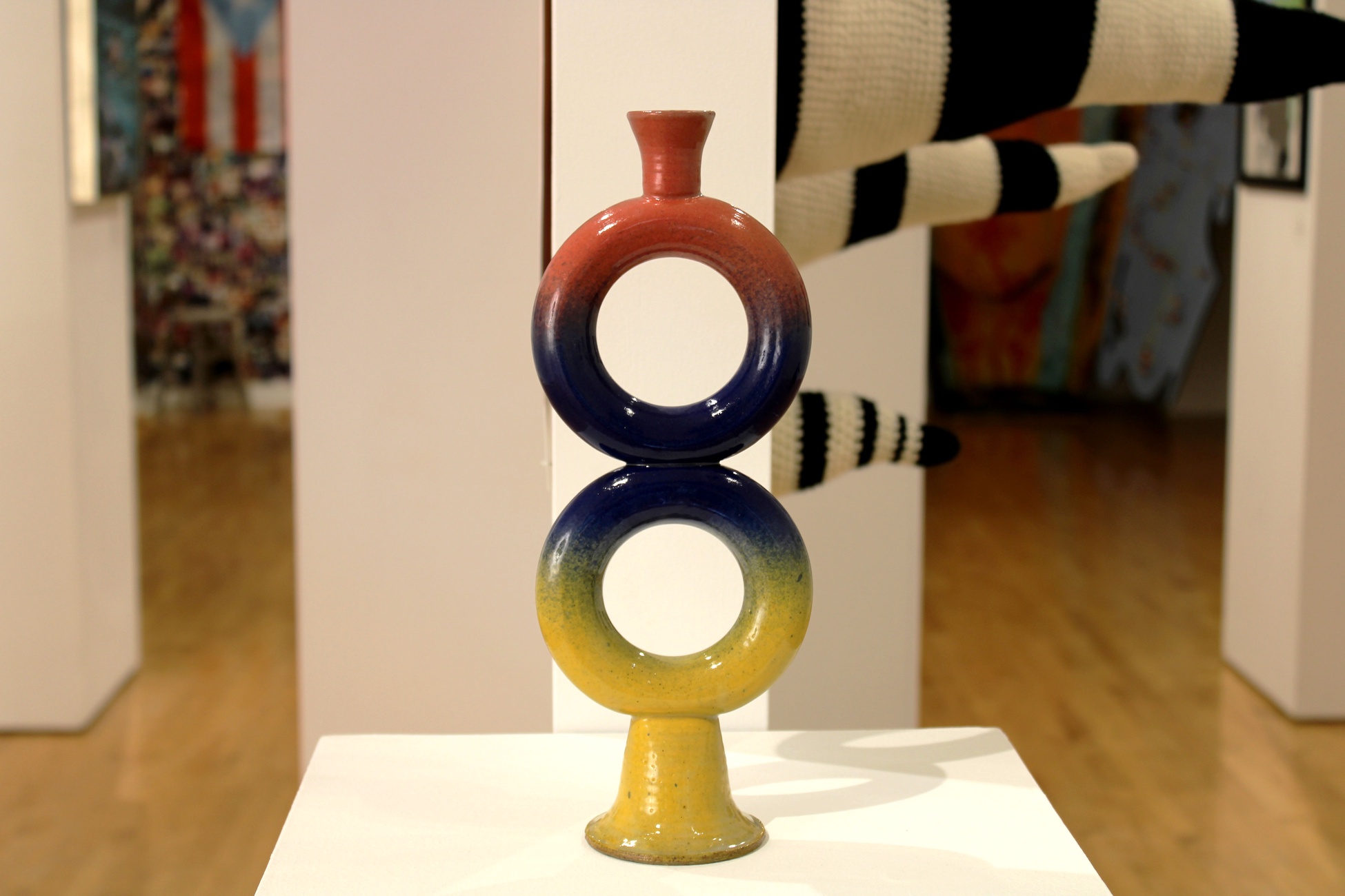
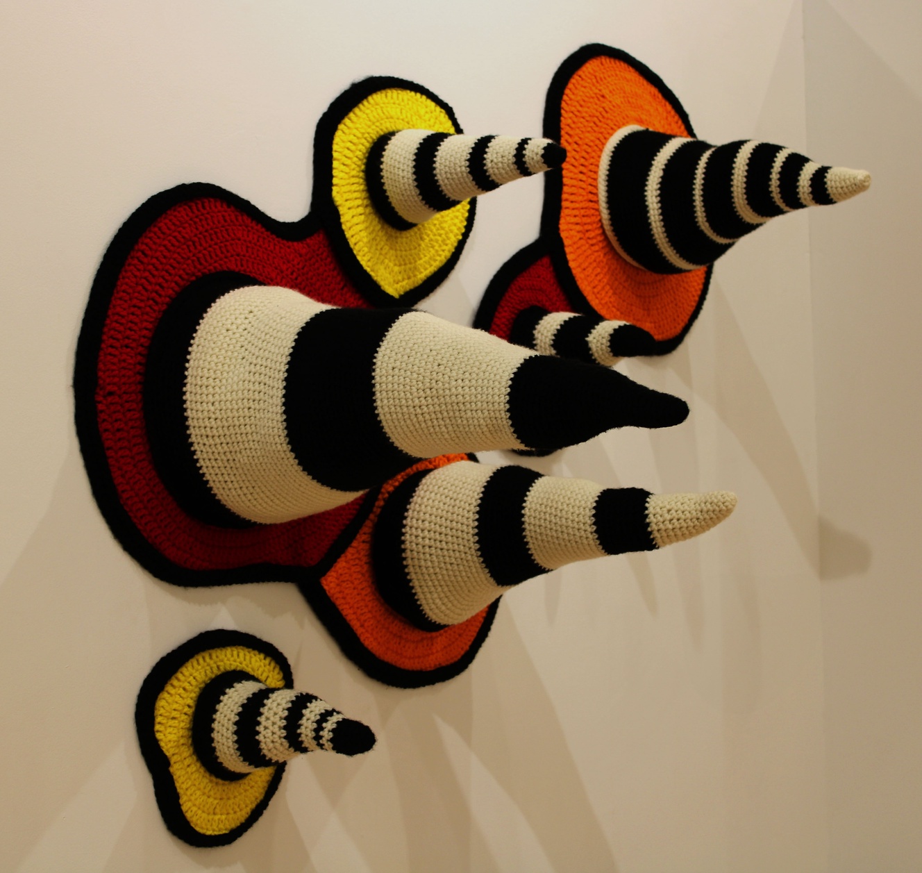
In my artistic practice, I go beyond traditional representations, opting instead to create a visual experience that encourages viewers to engage their imagination. The objective is to connect with a diverse audience through my art, creating work that resonates with a wide range of individuals. To achieve this, I use universally recognized shapes and forms, incorporating vibrant colors and patterns, varied textures, and deliberate repetition.
The rhythmic rotation of the pottery wheel serves as an inspiration, compelling me to expose the unique textures and elements in this technique. I practice this by incorporating circles, a shape that coincides with the act of throwing, and intentionally preserving the marks left during the throwing process - a reminder of the transformation from a humble lump of clay to a finished art piece. I believe it is the artist’s duty to showcase the medium’s finest traits and push the boundaries within that medium.
Similarly, in my approach to crochet, I reshape the purpose of two- dimensional creations, transforming them into three-dimensional figures. Through crochet, I can create a wide range of textures, details, and colors in each stitch, offering an individual detail in every square centimeter.
Recognizing the impact of color and texture in the mind, I invite viewers to explore the world of abstract shapes and colors, prompting them to create their own unique interpretations.
I create art beyond tradition using colors and shapes to connect with diverse audiences, drawing inspiration from my pottery and crochet techniques.
 |
Sarah Corcoran |
 |
Sarah Corcoran |
DINADJA DAVIS
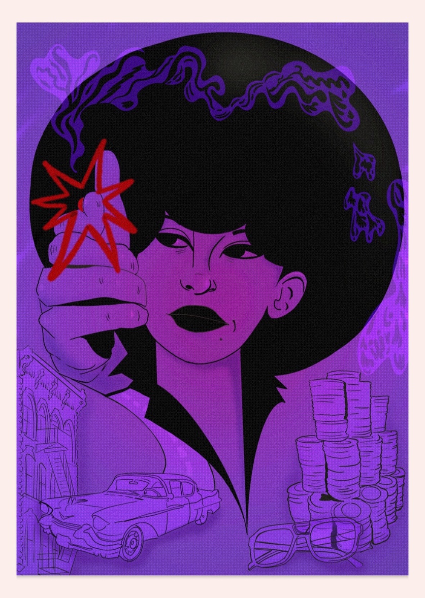
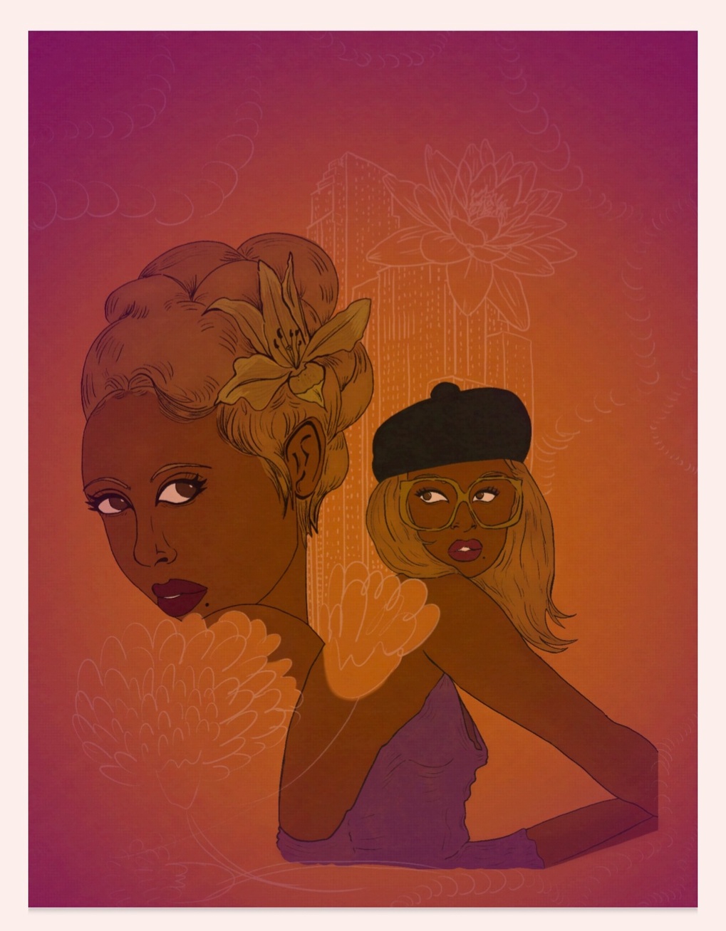
My art is about the representation of people of color, women in cartoon/ comic book style illustration. I want to depict women of color in a very cartoonish style that conveys playfulness. These posters were created to show off the playfulness of the 70s and the blaxploitation films, a genre of lighthearted and fun action films highlighting black leads.
My intention is to have representation in a whimsical and joy filled expression that is often lost in depictions of women of color. My art showcases the intersection between art and technology. This has always fascinated me so creating digital works of art is a way that I can learn more about this. Through the use of Digital art and gouache paint, I emphasize the intersection of art and technology. My work is often inspired by this intersection as well as the vintage comic book style (used in my posters), nature, fashion, films, and photography.
These illustrated posters relay my intention by showing that art can be a means to explore creative problems and to have an outcome to present at the end. It is a fun process, and a great way to showcase fictional or realistic stories that you may not be able to tell otherwise.
 |
Dinadja Davis |
 |
Dinadja Davis |
LUCIA DENTZ BLUM
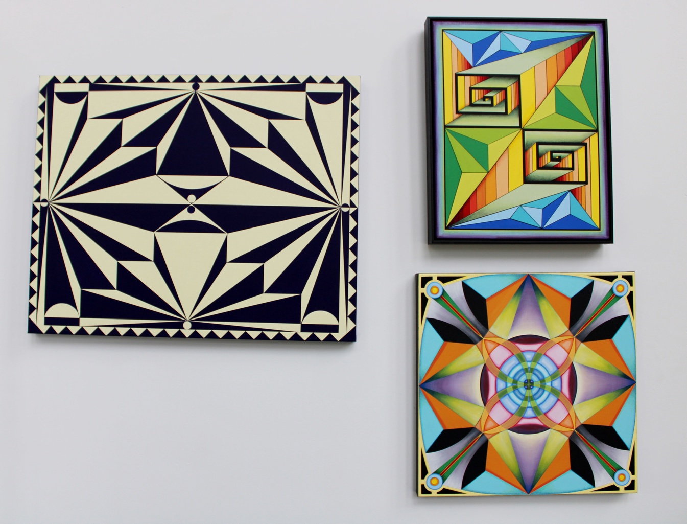
My paintings are an exploration in color, order, control, and abstraction to express who I am as an artist in this moment as I exercise my autonomy in the creative process. I want to draw the viewer into my work to explore the designs and feel the colors as I do.
My Creator is the source who inspires me to create so I can communicate with or affect the viewer. The work is about personal control, or lack thereof, over the universe. There is perceived control, and then there is the fact that we have no control over most of what happens; most certainly we have no control over the universe. But within the studio and on a canvas, I am the creator of that space, and my Creator has given me absolute authority and free will to make my own choices in it. This is freedom. The care and planning in my work reflect my Creator, God, who supplies me with all that I need to produce. The abstract designs allow the viewer to draw their own conclusions and see the work in their own way. Each work has a spiritual narrative for me, which speaks to His grace and planning. I don’t believe our God is the author of chaos. Humanity has created some chaos, but we have the power to take back some control and make order of it.
I am inspired by the vibrant colors I see in the natural world, like a bright pink Camelia against a dark green leaf, or colors of exotic species that seem to embody the spectrum. Divine design to attract a mate or warn a predator, God’s creation is full of color combinations demanding attention; this influences me in my color choices.
I find peace in the known plan and my ability to navigate the outcome as far as I am able. Even so, the unplanned still exists; some things could change along the way or not turn out as planned. This uncertainty allows me to paint by faith with a willingness to see what unfolds on its own.
 |
Lucia Dentz Blum |
 |
Lucia Dentz Blum |
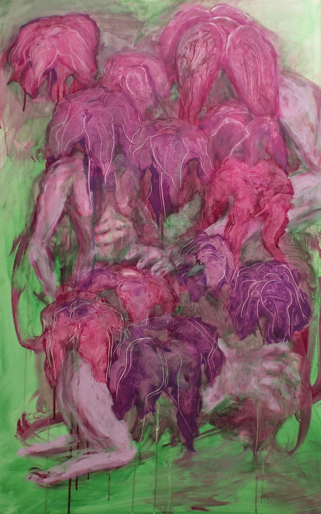
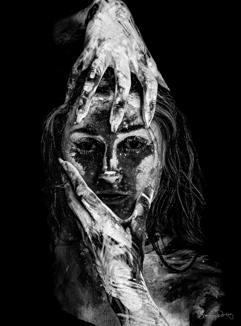
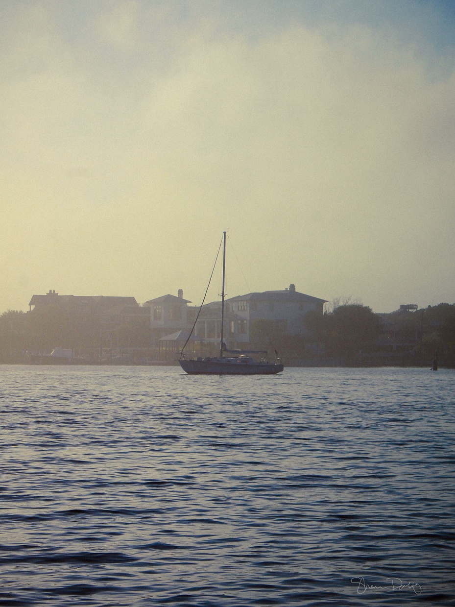
SHANNON DOWLING
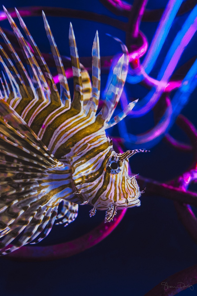
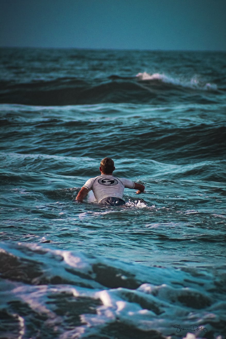
I use photography and painting as a representation of the deepest parts of my mind and memories, reflecting the way I view the world. I am an escapist, in the sense that I always find myself wanting to escape reality and go to another world. I use art, music, movies, and video games to escape my reality, and each of these things heavily influences my style. I create entirely different environments that draws the viewer into a different mindset, even if just for a moment.
My art is the tool I use to bring my escapes into reality; my work does not have to be realistic or make sense. I have ADHD and an anxiety disorder, so I spend a large amount of my time thinking, much of it daydreaming. My neurodivergent brain can make things difficult, but I take that and use it as my superpower and fuel for a career. After therapy, I spent a great deal of time working to research and self-reflect to help me understand the world. This allows me to stay grounded and explore my emotions and release them in a way that empowers me.
Through painting, I find a freeing, flowing release, with no rules and I can express myself without breaking boundaries. Photography allows a connection to the same free-flowing release for me, but it challenges me to find ways to explore and embrace the reality around me, especially with nature. I feel that these neurodivergent strengths allow me to have an almost wider understanding of life and what it means to be human; to feel things by allowing me to look deeper into what it means to feel and process things. I am proud to be able to share these works and the journey I have taken, where I am at now, and where I am headed next.
 |
Shannon Dowling |
 |
Shannon Dowling |
 |
Shannon Dowling |
 |
Shannon Dowling |
 |
Shannon Dowling |
KELSEY DRAKE
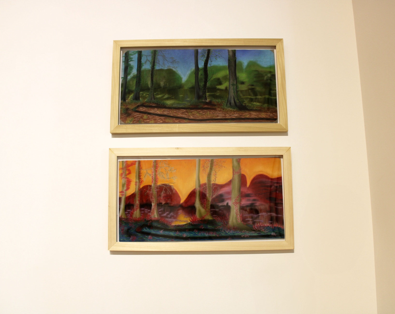
My paintings translate feelings into imagery. I want my viewers to feel a specific type of emotion when seeing my pieces. The emotions are translated into specific landscapes in varieties of color. I want to put feelings into visuals my audience can see.
I use oil and soft pastels on canson paper. An element that helps define emotions for me is the use of color, and pastels are incredibly rich in color. I love using pastel because the colors blend so seamlessly against each other. These blends can create a soft calmness with cooler hues. This softness can lead to displaying feelings of peace, sadness, or contentment. The warmer hues have the tendency to radiate against each other. The warmth helps communicate feelings that can range from happiness, to anger, to anxiety.
My goal is for the feelings presented in my paintings to guide how others feel when viewing my work. Whether they see my own emotions or their personal emotions, I want to make them feel something.
 |
Kelsey Drake |
THERESA DUNBAR
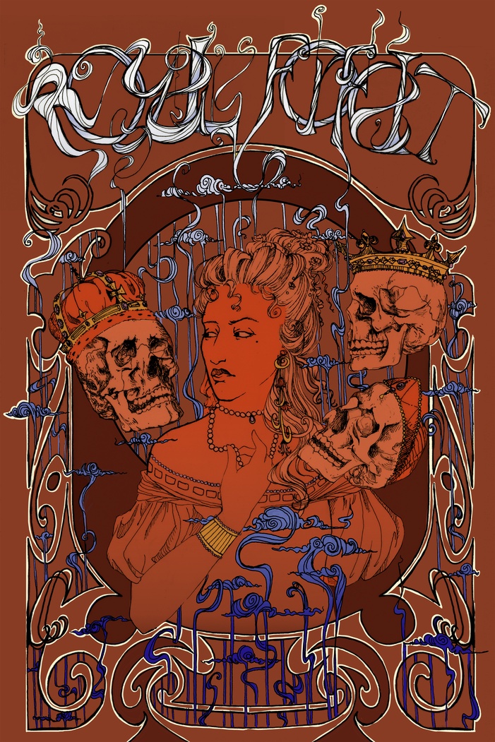
Before my room was converted to a personal workspace, the walls were covered salon style with art wall to wall: spreads from outdated calendars, illustrations clipped from thrifted books, saved packaging with charming illustrations. My little gallery was a reflection of what I found engaging and endearing; in turn my senior exhibit work follows the same theme. I take huge inspiration from art history. I am particularly attracted to art movements that embrace romantic depictions of the beauty of nature, decadence, and the human form, such as the Pre-Raphaelite Brotherhood and Art Nouveau. Deriving compositional and subject choices from the movements, I then look to the Golden Age of Illustration, Psychedelic Art Nouveau Revival, and many contemporary designers for stylistic elements to incorporate.
Using a combination of traditional illustration with ink and digital design, I created the poster work solely for the purpose of being illustrative art.
Visual motifs inspired by the likes of Alphonse Mucha, Gisbert Combaz, Mabel Dearmer, and Wes Wilson to elevate my concepts via details of ornamentation, line weight and style, and typographic design. I emulated the aesthetics of ephemera from roughly the years 1800 – 2000, such as cigarette and concert advertisements that were beautiful beyond their initial function of marketing, beautiful enough that people took them off the streets and hung them up in their own little salons just like I did.
 |
Theresa Dunbar |
ERIN GABRIEL
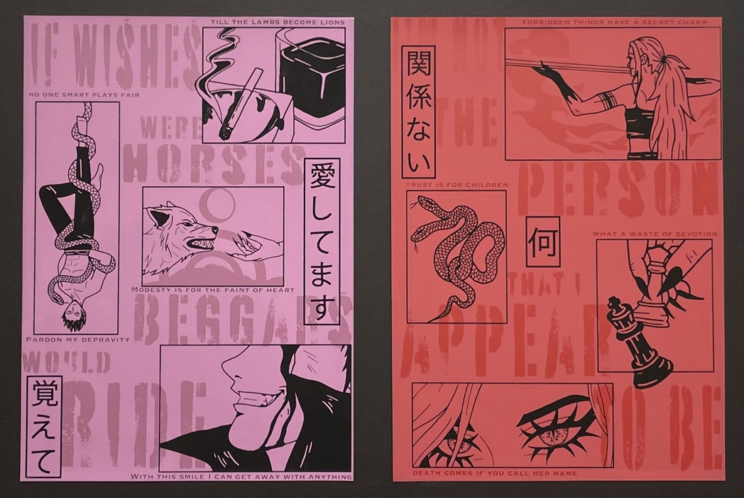
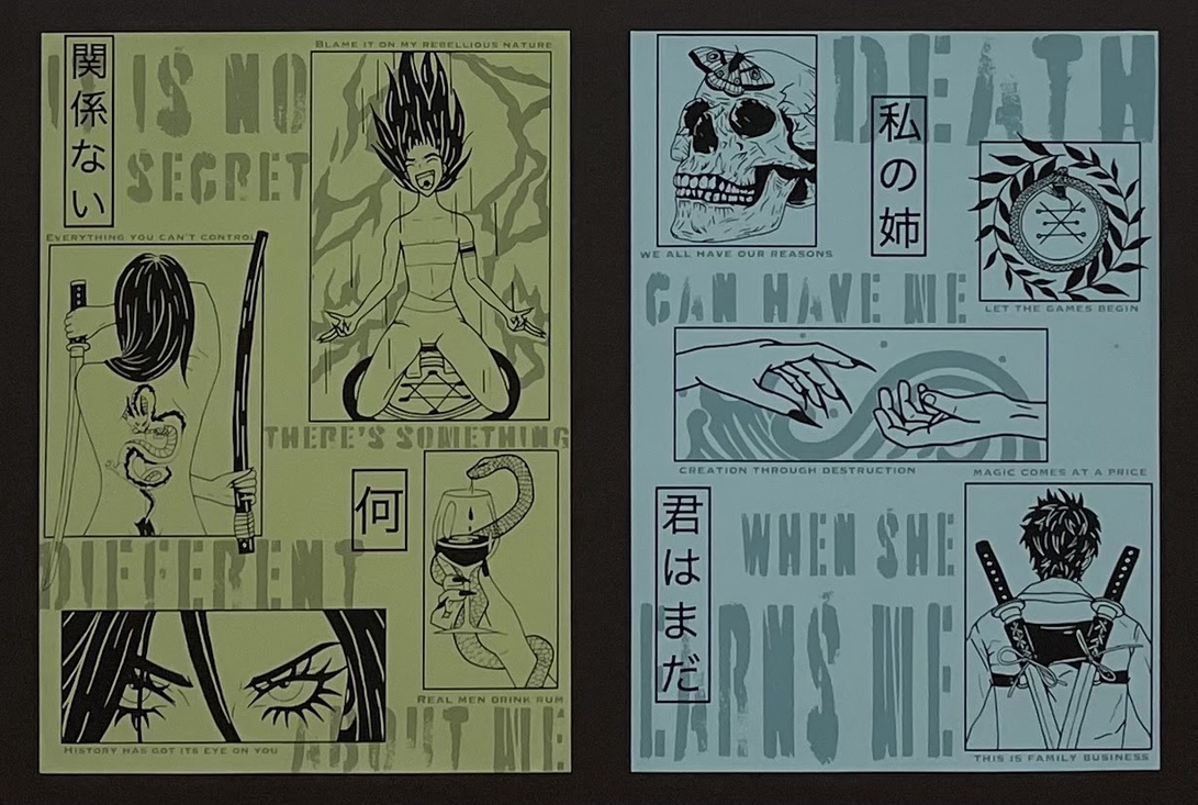
Inferis is a series of four screen-printed posters based on a supernatural fiction novel I’m writing. When I started writing this book almost two years ago, I knew I wanted to create artwork for it. For this series, I produced multiple prints that I would describe as character vision boards. Each poster represents one of the protagonists or antagonists with a color pallet symbolic of their personalities. It is important to showcase these characters and my novel because of how much they relate to me and my life. Inferis is my first attempt at combining my passions for both art and writing.
The prints are titled after my four main characters: Sage, Sebastian, Scarlett, and Elijah. Sage and Sebastian are siblings from Earth with magical abilities. They end up in the Underworld, or Inferis, where they find a rogue werewolf named Elijah. The siblings rely on Elijah to survive in this foreign world, and the three form a tight bond. Scarlett’s connection with everyone is unique because Sage and Scarlett are the same person, like a split personality. Because of that, I made the artwork in my green and red print similar.
Some of the line-art designs in my posters are more literal, like snapshots of a scene or descriptions of their appearance. The rest are heavily symbolic to give the viewers a glimpse into their personalities. The text scattered throughout the backgrounds are quotes from the individual characters. The Japanese writing throughout the prints are important quotes in the story. One is shared between Sage and Sebastian and says, “No matter what, you’re still my sister.” The other is between Sage/Scarlett and Elijah: “No matter what, remember I love you.” The repetition of those lines is a nod to a saying that I’ve always lived by: whatever happens, happens.
 |
Erin Gabriel |
 |
Erin Gabriel |
MADISON GIBSON
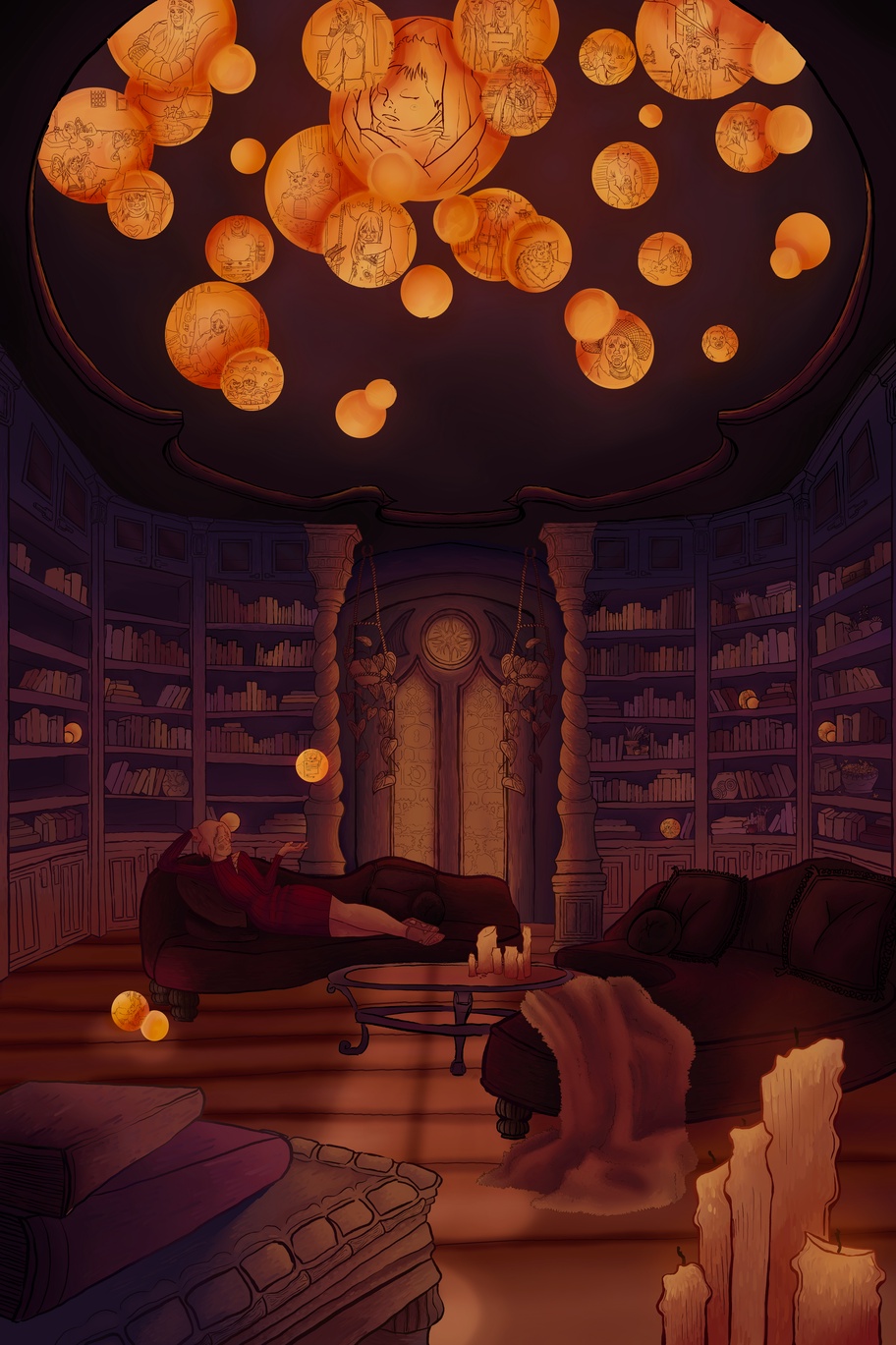
The primary focus of my art is to create an illustrated scene for the viewer to explore. The title of this work, The Memory Keeper, hints towards the job of the character we see in this environment, which is to sort and keep memories similar to how a librarian keeps books. This piece symbolizes my mind and the collection of memories I have made in my life up to this point.
My works are based around building a world and a narrative through the exploration of illustration and design. When creating these environments, I usually like to let the viewer interpret most of the story themselves.
However, for this piece I chose to create a narrative for the illustration to follow. I created many small details in this work. I chose to include real photos to display in the orbs because I thought it would give the viewer a better understanding of who this piece is about. For the color palette, I used colors that were reminiscent of my childhood home, which predominantly contained warmer colors. I wanted to add another layer of individuality and nostalgia that pertains to me.
I draw most of my inspiration for my artworks from video games, tv shows, and internet culture as a whole. Studio Ghibli is what influenced me to make this large-scale piece. Seeing their detailed backgrounds for their films reminded me that art isn’t always about characters, but also where you’re placing your characters. Seeing a beautifully designed character on a solid color or patterned background isn’t as interesting as placing them in a scene. By doing this, the viewer can imagine the character interacting with their environment. I added plenty of objects into this scene to keep the viewer engaged with such as book titles on each book and certain objects from my memories. My art is centered around creating an immersive, visual experience for the viewer that is meant to invite them into the piece.
 |
Madison Gibson |
KATHERINE HATLEY
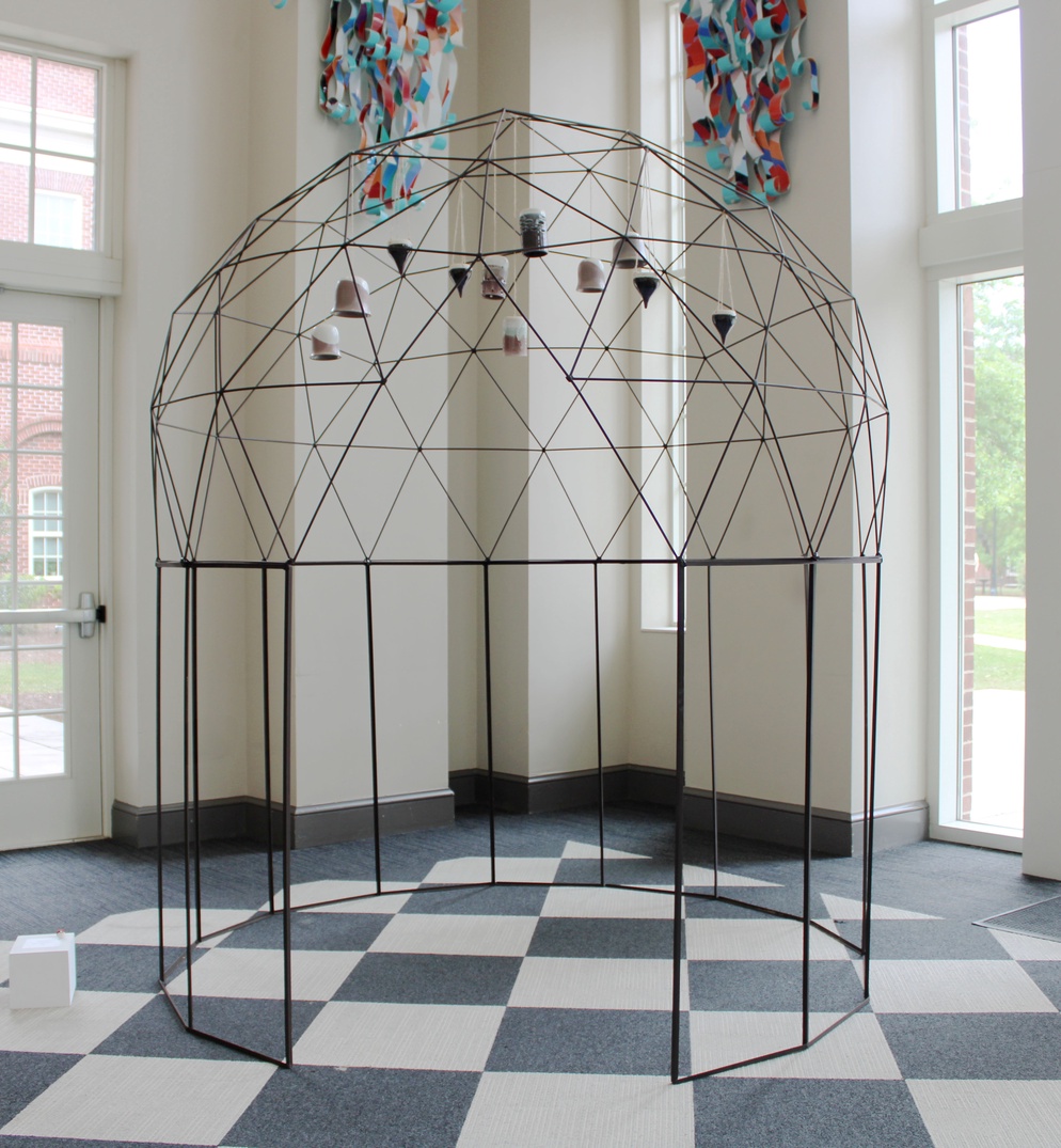
As an artist I create interactive, three-dimensional art that feels welcoming and is structurally beautiful. These spaces, made of metal and ceramics, flow together creating an escape from this treacherous world. My art is all about form, function, and precision on the outside, and ambience, safety, and creativity on the inside. I built an environment for my viewers to fully immerse themselves in, an experience. The goal is to make sculptures that people can move through and around; environments that feel like a secret hideout, private space, or escape from the real world. And, evoke a sense of wonder.
Today, we often need escapism to make it through and I want to create these spaces, so that people can stop and disappear into their own imagination for a moment. In a less than caring world around us, I hope to create a beacon of light within my art that will inspire viewers to take a moment to themselves, to pause and enjoy the present.
 |
Katherine Hatley |
ZAVIER MASS
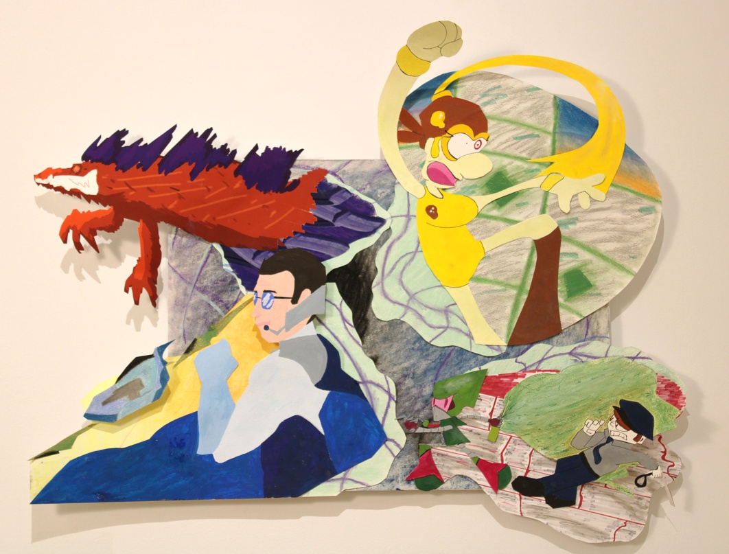
Cosm Torn Spirit is one of the most experimental and intriguing works I’ve made yet. The work is an abstract, out-of-this-world design involving portals to other worlds and characters of my own creation that vary in color, form, and style. I wanted a style clash in this piece to both challenge my range as an artist and represent aesthetics that interest me. The space and dimensional look of the connecting sections comes from my own love of science fiction and the abstract surrealness of outer space. The characters I designed represent different themes that I like; the yellow girl is a wacky cartoon, the blue man is a galactic hero, the red beast is a devious monster, and the green punk is a robotic rebel. The colors for each were picked to have an easy visual to differentiate each section and help stand out from the primarily purple, black, and white background.
To make this piece, I went for a mixed media approach and used graphite, gouache paint, vine charcoal, and Conté. I chose to use so many mediums to add to the surreal clashing quality of the design. The characters and visuals represent some of my favorite stylistic themes in design such as caricature, sci-fi, vibrancy and surrealism. I want my work to be something that embodies what I enjoy and practice in my own art on a regular basis. I want each section of my piece to have its own unique flavor; one section may be playful and silly, while another may be ominous and threatening. Cosm Torn Spirit represents both who I am as an artist and what I love creating. It is a surreal canvas of wild abstractions and motley characters made up of many different mediums. Creating this has taught me a lot about myself and what I want to make as an artist going beyond college and I hope I can keep improving my craft beyond this piece and keep on making more and more.
 |
Zavier Mass |
HOLT PARKS
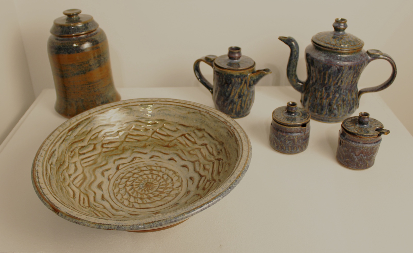
I enjoy making functional stoneware pottery because I believe that it creates a strong relationship between the artist, their work, and the observer/participant. Sculptures, paintings, and other visual pieces of art are amazing, but to me, functionality is essential. I prefer making my work for those who not only love art but need pieces to be usable in their daily lives.
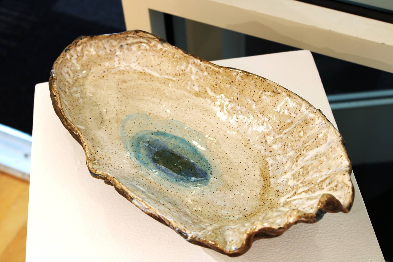
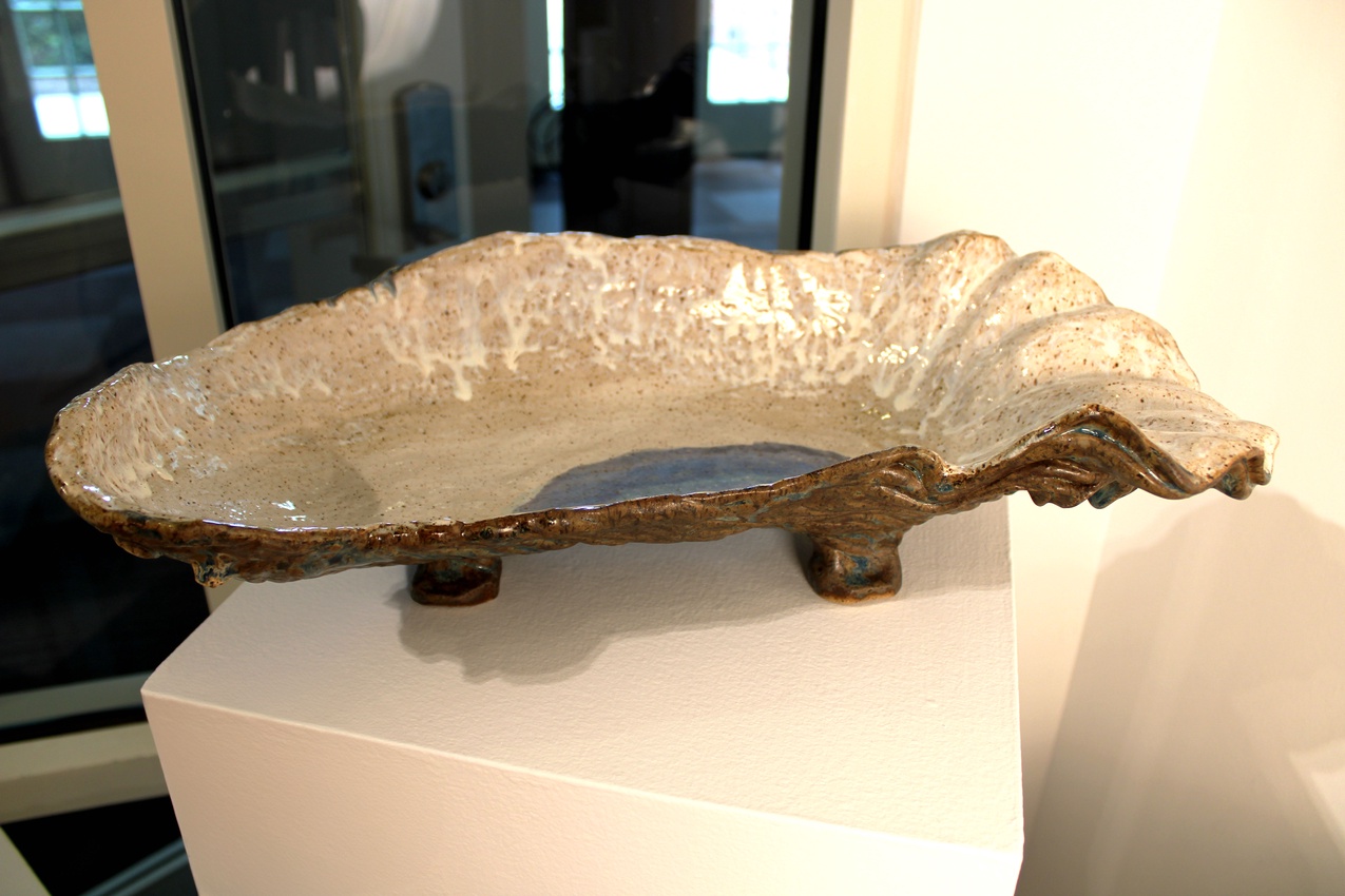
Most of my pieces are oceanic themed, based on light colors and organic forms from marine animals found in Wilmington, the place where I grew up. My family and I would travel along marsh creeks in inlets and beaches and see different kinds of fish, crabs, stingrays, sharks, dolphins, birds, and other marine animals. These experiences are the inspirations for my work.
Most of the time, I make vases, bowls, cups, mugs, and other forms using the potter’s wheel. I also like to use slab-building to make oyster shell bowls. Similar to oysters, a main constant within my work is to make pieces that are unique from each other; no two pieces are the exact same.
The functional stoneware pieces I make are made with the intent of being art that is usable. In several ways, my work is imitations of marine wildlife that are found in my hometown of Wilmington.
 |
Holt Parks |
 |
Holt Parks |
 |
Holt Parks |
LIZ PRECHTEL
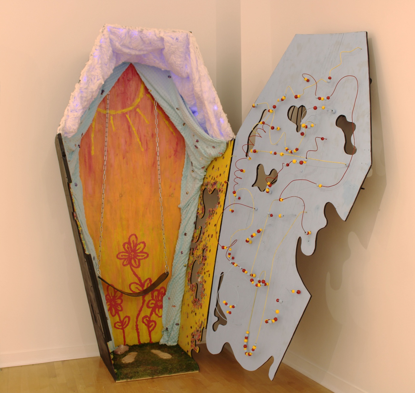
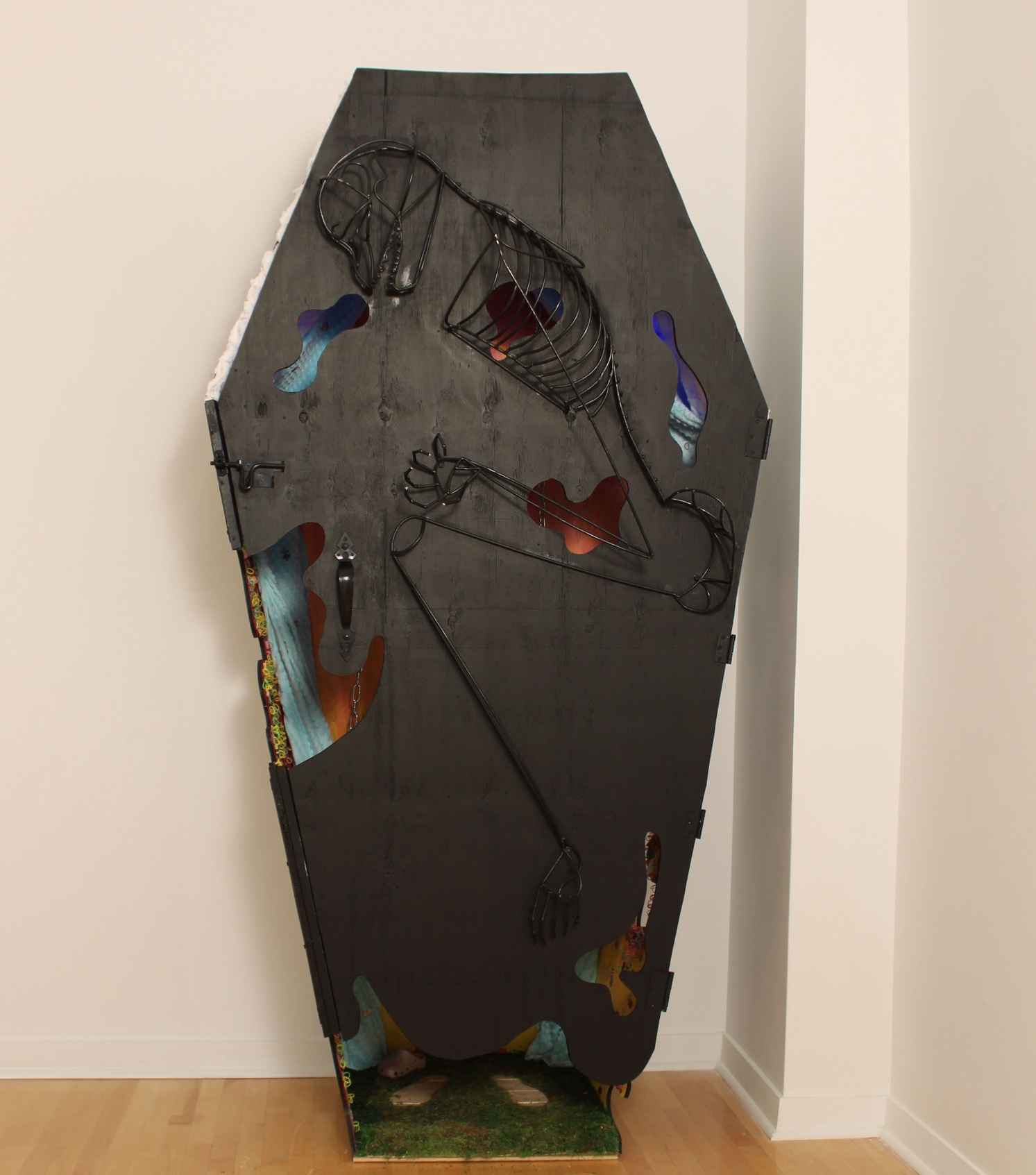
Throughout my struggles with mental health, the topic of identity has always led me to question and overthink my future. As a student that is about to graduate, the reality of adulthood is setting in, making these fears more prevalent than they have ever been before. My piece Welcome Home visualizes the fear of transitioning from a child with freedom into an adult with responsibilities. This transition can often feel like the life and vitality of your inner child has died, but my piece is meant to provide hope that your true identity can still shine through.
The interactive nature of this piece transports the viewer to a playful, nostalgic memory that can spark impactful takeaways from their experience. The exterior is representative of adulthood and appears very morbid, while the interior symbolizes childhood with its bright and exciting details. When taken at face value, this piece can appear as a pessimistic portrayal of what the future holds, but when you dig further by peering through the gaps in the walls or entering the coffin, you can begin to see the ray of hope through the darkness.
The process of creating this piece is helping me understand how my inner self doesn’t have to disappear due to adult responsibilities. It not only helps me understand my struggles, but also provides an experience for others that might be going through the same. My art process is always about exploring the parts of myself that can be hard to express through words, and I hope to provide solace for those with similar troubles. Although we all may experience uncertainty about our life path, this piece recognizes the importance of remaining true to who we are through hard times.
 |
Liz Prechtel |
 |
Liz Prechtel |
EFREN PUENTE IV
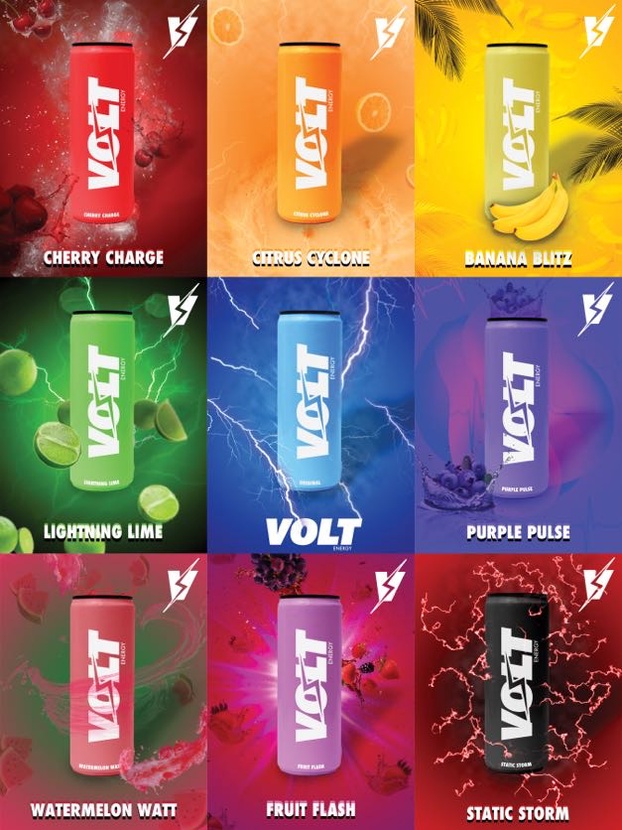
I created a unique look for Volt, a vibrant energy drink company. Using my skills in graphic design and photography, I crafted logos, typography, icons, and posters, capturing my interest in branding and design. I wanted to make a memorable impact by combining simplicity with powerful visuals and pops of color.
As the creator of this vibrant energy drink brand, I am driven by a passion to inject life and vibrancy into the lives of those who feel stuck in the monochrome of everyday existence. VOLT stands as a beacon of color and energy in a world often perceived in shades of black and white.
The decision to delve into the realm of energy drinks was a conscious one, driven by the desire to provide a literal and metaphorical “pick-me-up” for individuals navigating through the grayscale of modern life. In a society where fatigue and monotony often prevail, VOLT energy offers a burst of vitality and hue, awakening the senses and invigorating the spirit.
The choice of vibrant colors in my branding is deliberate, serving as a visual representation of the dynamic energy encapsulated within each can. From vivid reds to electrifying blues, VOLTs palette seeks to ignite a sense of excitement and possibility in those who encounter it. I believe that color has the power to transform moods and perspectives, offering a refreshing departure from the mundane and invigorating the spirit.
VOLT Energy is tailored towards those who crave more from life, who refuse to settle for the ordinary and mundane. It caters to individuals who yearn for a pop of color in a world that often feels grayscale, who seek to break free from the confines of routine and embrace the vibrancy of the unknown.
In bringing my vision for Volt’s visual identity to life, I used digital design tools such as Adobe Illustrator and Photoshop, alongside arranged photography setup and a lighting studio. Throughout the process, attention to detail ensured visual consistency, contributing to Volt’s cohesive brand identity, and creating a dynamic experience for consumers. Looking ahead, I’m eager to continue refining my style and making a meaningful contribution to the field of graphic design.
 |
Efren Puente IV |
 |
Efren Puente IV |
 |
Efren Puente IV |
BAILEY ROTH
Art is the one area I feel comfortable expressing myself fully. I create graphics using various mediums. I then pair and juxtapose each piece into a collage. Mixed media work has allowed me to produce art that I did not originally anticipate creating.
I am heavily influenced by cinematography, films, poster design, and art movements such as Surrealism and Dada. Aesthetically, my design choices are greatly indicative of my influences. I create graphic design work that has a mix of mediums and graphics that appear similar to fine art in its own niche. This gives each design character, and makes it feel more individually significant to the viewer.
I work with gouache, acrylic, color pencils, graphite, stippling markers, charcoal, and sometimes even fabric. The medium I select directly affects and is dependent on how I want each detail to be portrayed. This gives me more freedom with the complexity of aspects, such as texture, and the hier- archy or composition of the overall piece.
I create a crossover between graphic design and fine art. It is up to the viewer to decide whether there is a profound meaning behind the graphics themself. I find meaning in the actual process of construction. Personally, I find working for hours on elaborately detailed designs calming and gratifying. Mixed media design work has liberated me in this way, and facilitated the ability to produce innovative designs that are expressed within layers of my craft.
 |
Bailey Roth |
SYD STICH
My collection, Night Out, is an intricate interplay between texture, color, and form. In this work, I merge bitmap printmaking, textiles, and bead embroidery to create multidimensional works that blur the boundaries between digital and tactile, virtual and physical. I showcase the handmade and delicate details of bead embroidery by exploring themes of everyday life.
Every stitch that I do is an act of creation, a meditative process that allows me to engage with the material on an intimate level. Whether I’m working with delicate threads or vibrant beads, I am constantly inspired by the endless possibilities for expression that embroidery offers. Through my use of texture and color, I evoke a sense of depth and movement, inviting viewers to immerse themselves in the tactile world I have created. Each piece tells a story, a narrative woven through layers of thread and embellishment.
My goal as an artist is to create work that engages the viewer on multiple levels –intellectually and emotionally. Through the synthesis of printmaking, textiles, and bead embroidery, I create a dialogue that sparks conversation, invites reflection, and celebrates the beauty of human creativity. In a world that is increasingly fast-paced and digital, I believe in the enduring power of handmade art to connect us to our shared humanity and inspire moments of wonder and contemplation.
 |
Syd Stich |
ALEKSANDRA TAYLOR
I often focus on the negative, both physically and emotionally. Sometimes it isn’t easy to focus on the positive and “just be happy”. For many people, myself included, these negative emotions are heightened by mental illness. We’ve all heard of depression, anxiety, ADHD, and OCD, but we don’t always understand. Far too often, these disorders are simplified which leaves those of us diagnosed with them alone and leaves the people around us confused and in the dark. Having depression isn’t just being sad; it’s struggling to get out of bed in the morning. Anxiety isn’t just panic attacks; it’s the worry that everything you do is wrong. ADHD isn’t just being easily distracted; it’s focusing on something so intently that you forget to shower. OCD isn’t just cleaning impulsively; it’s losing sleep wondering if you checked the door lock. These are personal truths, and for those on the outside, it isn’t easy to understand.
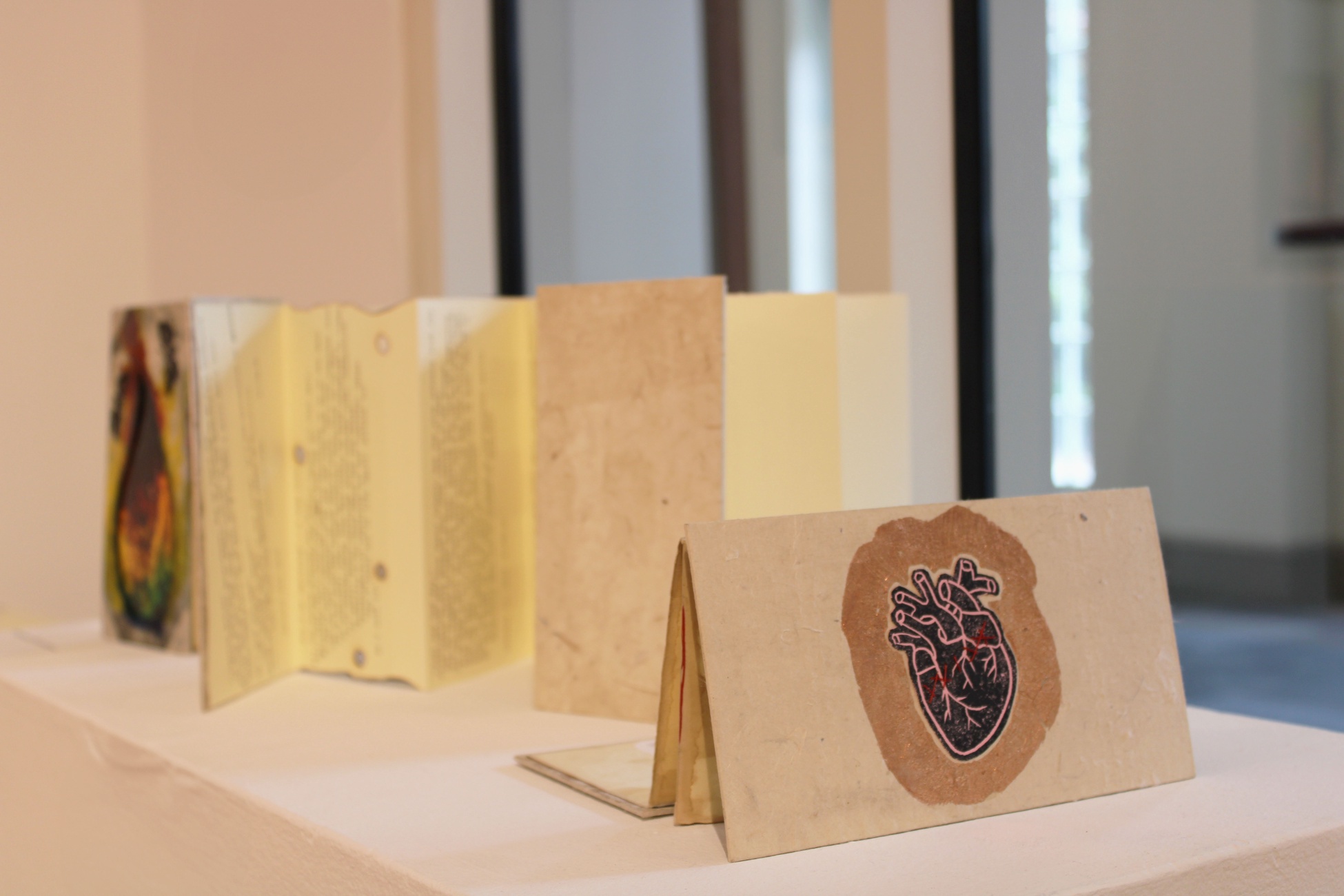
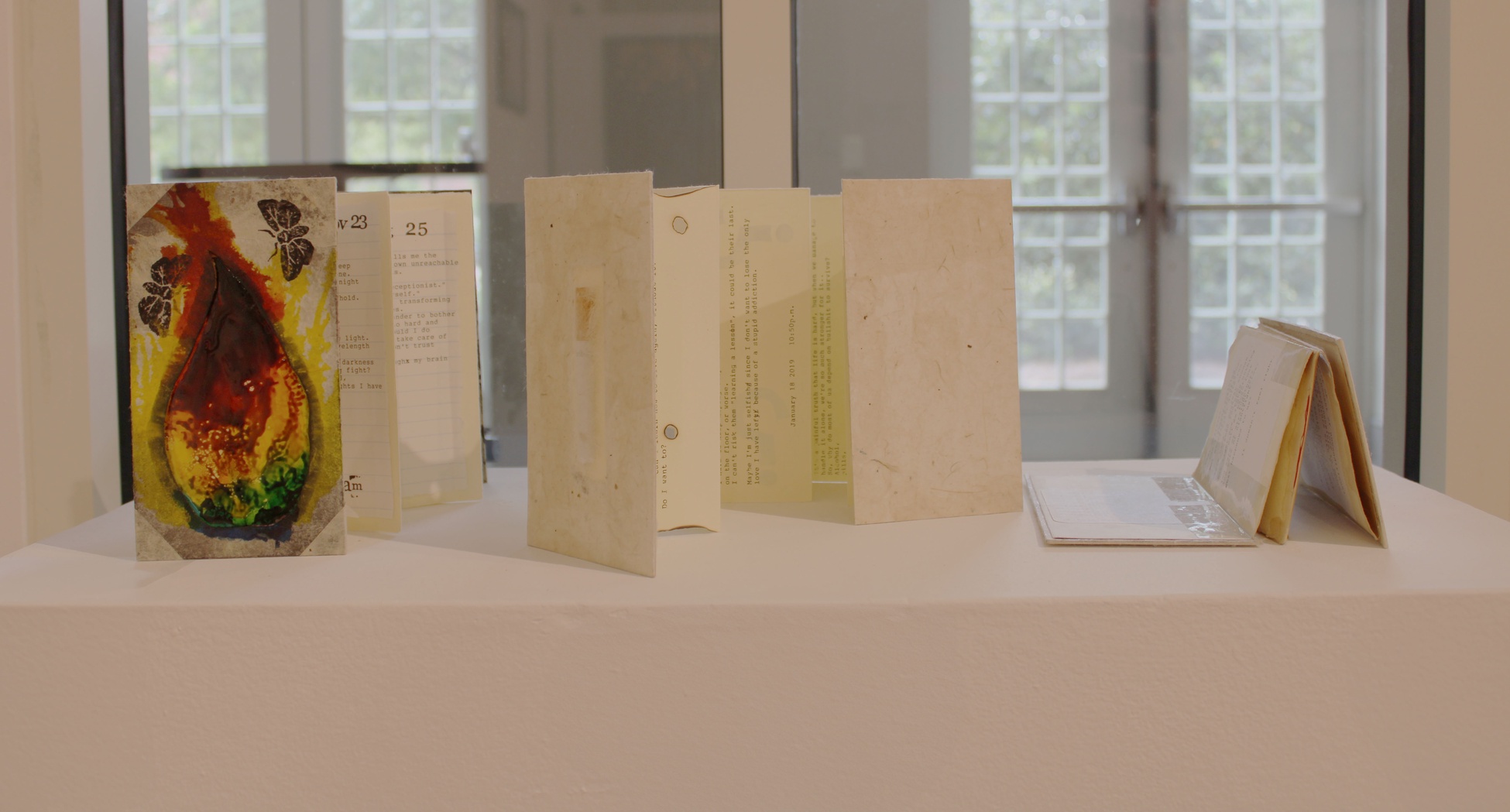
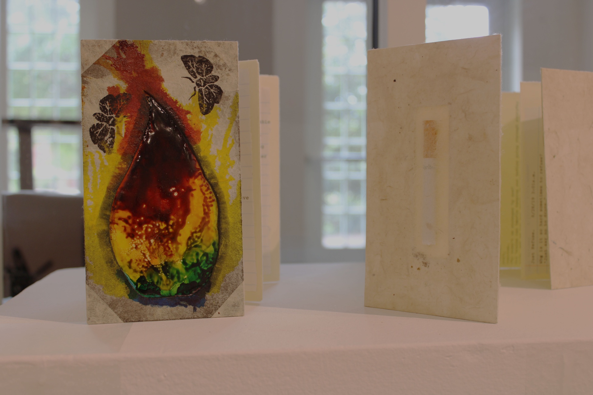
The intent of my work is to tell people they are not alone. I have compiled my poetry from the last decade and organized them into books. These books may look simple, but the experiences within are complex. After reading through my poetry, I realized most of them could be sorted into; Love/Loss, Depression, and Addiction. I want everyone to open these books and read something that resonates with them, even if it hurts.
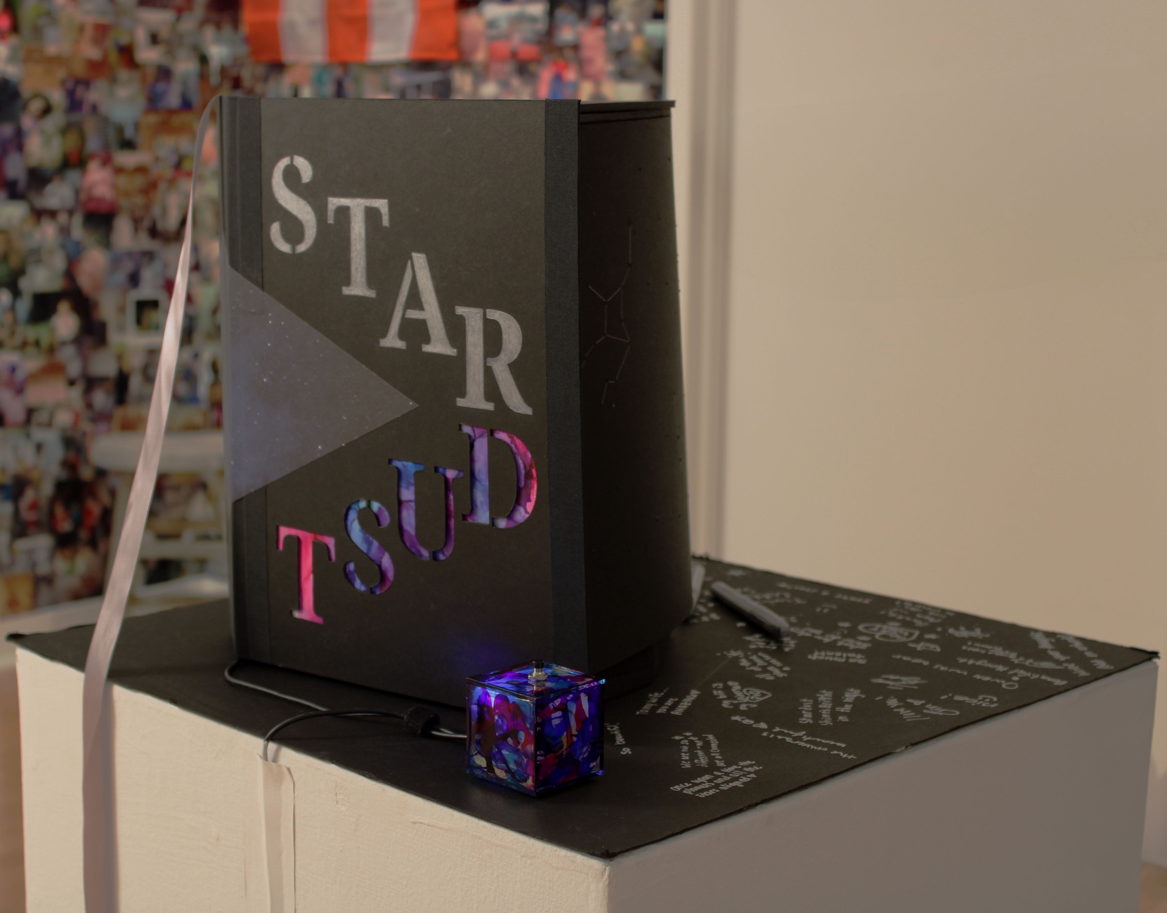
Struggling with mental illness on your own is almost impossible. I have spent my life trying and failing to fight this battle alone. After starting therapy, I have noticed the positive far more than I ever did. My sculptural book is an expression of this. I was staring at the night sky when I remembered Carl Sagan’s iconic phrase “we are stardust”. In this moment I was struck to write a poem. Being alone and feeling alone are two different things, but something about being made of the same elements as stars has made me feel like I always have family around me.
Many of us have or will have felt these often-incomprehensible emotions. My purpose with my work is to tell you “YOU ARE NOT ALONE.” For many a sleepless night, this phrase has been my blanket. As much as I wish no one experienced any of this, we have, and we likely will. It is no longer a statistical anomaly to have a mental disorder, it is a part of our world. I’m here to show you that you are not alone, that we are in this together, that you can talk to someone, and they will understand you. Above all, please keep going, even when it’s hard.
 |
Aleksandra Taylor |
 |
Aleksandra Taylor |
 |
Aleksandra Taylor |
 |
Aleksandra Taylor |
 |
Aleksandra Taylor Love/Loss Book board, handmade paper, deckled-edged paper, typewriter, hand-carved rubber stamps, construction paper, thread, bronze leaf 2024 |
VICTORIA VIDAUD
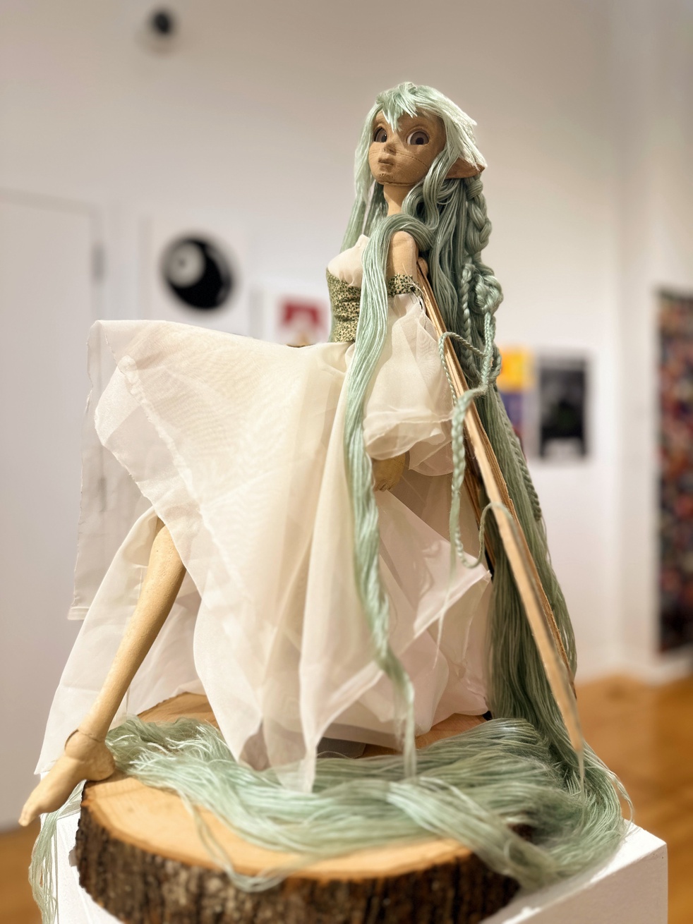
In my work, I am celebrating life’s small wonders through 3D printing ball-joint dolls and exploring traditional and modern craftsmanship
methods. My primary inspirations are Japanese art dolls, a passion for character design, and a desire to explore a new realm of creativity with 3D modeling and printing.
The work captures the magic of fairytale mythos and creates a sense of wonder that leads the viewer back into a childlike mindset of discovering something new. When you are a child, you can believe in anything, and by creating these dolls, I want to show the observer, as well as myself, that you can create beautiful things if you put your mind to it and believe in yourself. I also want to give a peek into a fantasy world as an escape from the mundane, as finding something new and wonderful is part of that childhood curiosity, while embracing new possibilities.
In order to produce my dolls, I digitally sculpted a body form, complete with articulated joints, and printed them using wood-fill filaments for the largest doll, and UV resin for the smaller one. After removing supports and excess seam lines, I strung the dolls together piece by piece with elastic cord and magnets. I want to continue in this line of doll-making as I move forward in my art career. I feel that I have recaptured my own sense of wonder and excitement by watching something I have created be ‘born’ line by line on these printers, like a child. Additionally, I feel that dolls are not a common sight in a formal artistic setting, therefore I wanted to elevate them and show them as a detail-oriented art form, rather than as just a simple plaything.
 |
Victoria Vidaud |
 |
Victoria Vidaud |
REAGAN WILLIAMS
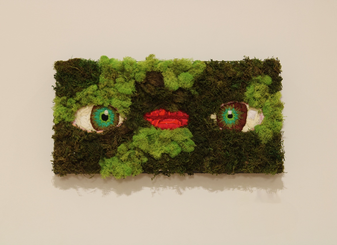
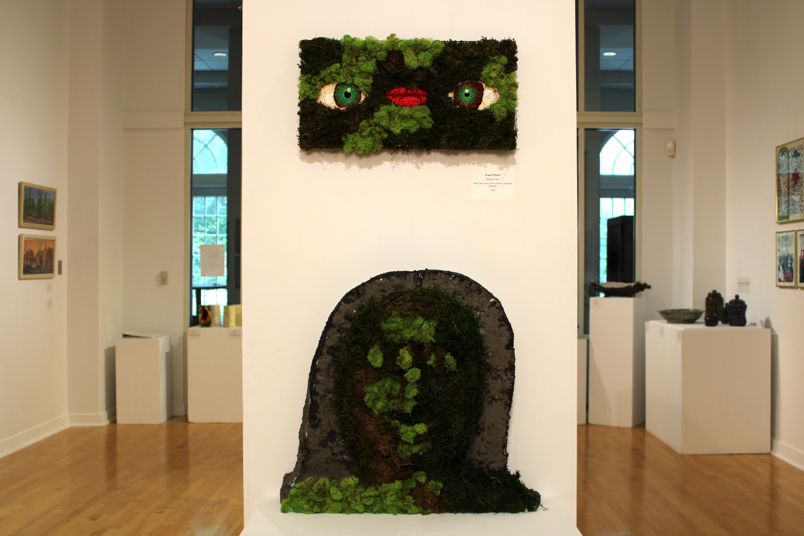
There are so many negative connotations around the female body between stereotypes and sexualization, which fuels my passion to create art focused on acceptance. My art is about the female body and nature. I love to experiment with materials and imagery that resemble the nature around me to explore the natural world. I either create art of women in nature or create women with natural looking materials. My intention is to create abstract compelling art that makes people look at the natural world around them in a new way.
I use moss, wood, and styrofoam. I lay out my desired design on the canvas, then I take styrofoam and create the mass of the shape that I am creating. Once I have created a sculpture that I like I apply moss to it in coordination with how light hits things naturally. I attach the moss to the styrofoam using mod podge and hairspray. I use fake moss in order to be in touch with the natural world around me without negatively impacting it by taking from it directly. This piece explores moss, a material that I have always been fascinated by, using a subject that is close to me.
My work is inspired by the world around me as well as my personal experiences as a woman. As a woman, it is important to me to explore the beauty of the female figure and physical attributes.
 |
Reagan Williams |
 |
Reagan Williams |
CAMPBELL WYNN
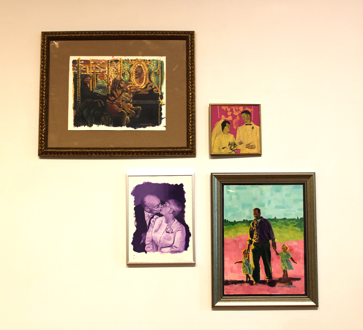
Through my series of paintings, I utilize color and figures to evoke nostalgia, drawing inspiration from cherished memories with my family. I work to recover these memories and depict them accurately yet expressively in my artwork. I invite the viewer to imagine themselves within my work and rediscover their memories through mine.
I created this series to reflect on my family’s experiences during this pivotal moment in my life. Every piece is uniquely influenced by my emotions connected to specific memories. While I draw inspiration from various artistic styles, my family remains the central muse for my work. Their involvement has been invaluable; they consistently contribute pictures and ideas for upcoming pieces. This collaborative process with my family is a significant and enriching aspect of the series.
My work can elicit a strong response from a wide audience because it is highly relatable. The paintings can cause feelings of joy by inviting viewers to envision their own families within the artwork. Conversely, the pieces can evoke harsher emotions for those without such fond memories. Regardless of one’s background, these paintings are bound to generate strong emotional responses.
My family serves as both the muse and subject in my paintings, infusing each composition with memories saturated in nostalgia. Through the interplay of color and form, I strive to craft narratives that transcend my personal experiences, inviting viewers to connect with their understanding of family and the emotions it elicits.
 |
Campbell Wynn |
